Lilon WordPress Theme Review: Personal Portfolio, Perfected
-
The Weekend I Rebuilt My Career: A Full Review of Lilon
I didn’t mean to rebuild my entire online identity in one weekend. I just wanted my portfolio to stop feeling like a dusty résumé and start working like a confident greeting. That’s when I picked Lilon. For clarity, I used this exact item: Lilon – Personal Portfolio WordPress Theme. What follows is my unfiltered, first-person review—part diary, part teardown, and part field manual for anyone who wants a portfolio that feels human, reads fast, and quietly converts views into conversations.
Day 0: The Problem I Wanted Lilon to Solve
I was juggling PDFs, outdated screenshots, and a blog that sounded like a broadcast from a deserted island. People kept asking for “one link that shows everything quickly.” I didn’t need fireworks; I needed flow. My goals:
-
Tell a one-minute story on the homepage without shouting.
-
Present three to five “selected works” that feel curated, not hoarded.
-
Make case studies scannable in under two minutes, with a clear arc.
-
Keep a Notes/Blog space for thinking out loud without hijacking the portfolio.
-
Offer a contact path that feels like a short conversation, not an intake exam.
Day 1 Morning: Install, Import, and That Rare Feeling of Calm
Installation was uneventful in the best possible way: theme → child theme → demo import. Navigation, typography, and spacing held together. The starter sections already matched how I wanted to talk:
-
A hero that insists on a concise headline and a single action.
-
A “Selected Work” grid with room for short one-liners.
-
A simple services row (if you sell your craft directly).
-
A testimonial strip that doesn’t scream.
-
A contact section with humane labels and sensible spacing.
I swapped the accent color to a muted sapphire, reduced H1 size slightly for laptop comfort, and tightened the hero’s top padding so the first fold feels like a handshake, not a billboard. Lilon didn’t fight me.
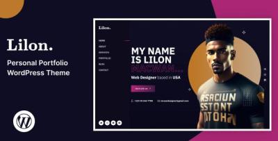
The Hero: Fewer Words, More Signal
Lilon’s hero block is delightfully opinionated. It wants a strong headline, one supporting sentence, and a primary CTA. Here’s where I landed:
“I design clear, conversion-ready interfaces.”
Case studies below; booking select projects for the next quarter.CTA: See Selected Work. This sequencing matters. Strangers want proof before a pitch; proof lives one scroll down; the invitation to talk waits politely.
Selected Work: A Grid That Teaches Restraint
Lilon’s portfolio grid works because it forces choices. I chose five projects, each with:
-
A tight one-liner (“Rebuilt onboarding—drop-off down 31%”).
-
One expressive hero image.
-
A clear label for role (Product Design, UX Writing, Dev, etc.).
-
A compact “Challenge → Approach → Outcome” structure on the detail page.
The card layout makes verbose titles look silly. That helped me cut the fluff. I also resisted the urge to flood the page with logos, and Lilon rewarded the restraint—the grid breathes, and your eyes don’t sprint.
Anatomy of a Case Study (The Lilon Way)
Every project page followed the same five-beat pattern:
-
Context: One sentence your non-tech friend could repeat.
-
Constraints: Timeline, team size, platforms—your honesty magnet.
-
Key Moves: Three bullets max (e.g., simplified pricing, error-proofed forms, built tokens).
-
Outcome: A number if you have it; a before/after if you don’t.
-
Proof: One quote or a compact chart; no brag walls.
Lilon’s typography and section rhythm reward this economy. Long paragraphs feel out of place, which is your cue to sharpen the story rather than expand it.
Services, Without Sounding Like an Agency Brochure
Even if you’re not “selling services,” prospects want to know how you fit. I kept three cards:
-
Product Design — flows, components, and design systems.
-
Brand & Site — identity, tone, and a fast portfolio build.
-
Advisory — audits, hiring help, and honest second opinions.
Each card used two sentences and a tiny “What you get” list. Lilon’s iconography is gentle and stays out of your way.
Diary Interlude: A 48-Hour Rebuild That Actually Stuck
Friday 6:30 p.m. Installed Lilon; imported demo; chose colors (two neutrals + one accent).
7:15 p.m. Wrote the hero copy; replaced filler images.
8:30 p.m. Drafted three case studies in bullet form; ignored perfection.
Saturday 9:20 a.m. Shot a window-lit headshot; Lilon’s soft mask made it look studio-clean.
11:00 a.m. Tuned galleries; cut any image that didn’t move the story.
2:00 p.m. Wrote “How I Work” in four steps; kept it friendly.
4:10 p.m. Performance pass—compressed hero, deferred below-fold media.
Sunday 10:00 a.m. Two Notes posts (short, practical).
Noon Trimmed contact form to five fields; added one reassurance line.
3:00 p.m. Quiet launch. First booking request hit Tuesday morning.Editing Experience: Give the Non-Developer the Wheel
I asked a friend with zero WordPress experience to update a caption, reorder projects, and change a button label. She did it without questions. Lilon’s blocks are named like a human would name them, spacing controls are sensible, and previews match reality. This matters more than any animation—you’ll actually keep the site current.
Writing With Lilon: Micro-copy That Pulls Weight
-
Buttons: “See selected work,” “Start a conversation,” “Read case study.”
-
Labels: “Timeline” instead of “Project time,” “What’s the goal?” instead of “Message.”
-
Hints: “Two or three sentences is perfect.”
-
Empty states: “New note next week—short and useful.”
-
404: “Lost? Start with selected work.”
Short lines read like design when the typography is this clean. Lilon makes you look disciplined.
Notes/Blog: A Place to Teach Without Hijacking the Work
I don’t want a content empire; I want a breadcrumb trail of thinking. Lilon’s article layout keeps the reading width comfortable, centers media without drama, and never lets the blog cannibalize the portfolio. I use Notes for 300-600-word riffs: “Design debt triage,” “How I cut onboarding fields,” “Naming tokens like an adult.” One good post a month beats a daily trickle of filler.
Contact: Frictionless, Not Forensic
I trimmed to five inputs: name, email, company, timeline, and a single open field. I added one sentence: “Short and sweet is perfect; we can talk details on the call.” Lilon’s form styling keeps errors close to fields and never relies on color alone. I also placed a “Working with me” sidebar (scope ranges, typical timeline, next steps). Result: fewer back-and-forth emails and better-fit inquiries.
Performance: Speed That People Actually Feel
On a modest VPS with caching and sensible image compression:
-
LCP (mobile emulation): low-2s before hero trim; high-1s after.
-
CLS: stable; the theme reserves media space and avoids jumpy carousels.
-
JS: lean—no novelty libraries sneaking in weight for fun.
-
Fonts: two weights total; swap strategy set; zero flicker theatrics.
Visitors described the site as “quick” rather than “pretty fast.” That’s the remark you want.
Accessibility: Courtesy, Baked In
-
Logical tab order and visible focus outlines.
-
Labels that are labels (placeholders are not asked to do adult work).
-
Error messages that don’t depend on color alone.
-
AA contrast out of the box, with easy tweaks to lock it tighter.
-
Motion that errs on the side of calm; “reduce motion” is respected.
Good manners scale your reputation long before an audit does.
Photography & Mockups: The Minimum That Looks Premium
Lilon punishes sloppy imagery in a kind way—it simply refuses to flatter it. That’s good. I kept a tight set per case study: one hero, two detail crops, one context shot. I stopped shoving logos into every gap. The grid rewarded the edit. When in doubt, I chose daylight and restraint; Lilon’s soft shadows did the rest.
Navigation That Knows Its Role
Header: Name/Logo, Work, About, Notes, Contact. The Contact button is the only CTA in the nav. On mobile, the sticky header is present but not clingy. The footer offers email, city, and a single “now booking” note—no link graveyard. This keeps attention anchored to the work.
A Short, Opinionated Style Guide I Now Live By
-
Headlines under six words.
-
One long paragraph per page for rhythm; the rest short.
-
Two type weights, total.
-
One hero image per page; no autoplay anything.
-
Four images per case study unless the complexity truly demands more.
-
One primary action per view (everything else gets demoted).
Lilon’s defaults nudge you toward these rules. Let them.
What I Customized (Lightly)
-
Color system: accent, neutral, and semantic states (success, warning) nudged for AA.
-
Typographic scale: H1 reduced a hair; captions bumped one step on mobile.
-
Card radius & shadows: softened slightly for a “quiet premium” tone.
-
Spacing: hero tightened on laptops; gallery gutters widened on desktops.
All of this happened in a child theme with a handful of CSS variables. No messy forks, no future-update dread.
Questions I Got, Answered by Lilon’s Structure
“Can you show something like our industry?”
Yes. The selected work grid surfaces two relevant projects immediately; tags on project pages guide to cousins.“What’s your process?”
A four-step “How I Work” page: discovery, design sprints, validation, handoff. Short, friendly, and honest.“How soon can you start?”
The hero’s second line mentions booking windows; the contact sidebar reiterates typical start times.“What will it cost?”
I offer ranges, not quotes, and place them next to the form—no surprises after someone clicks “send.”Metrics After Four Weeks (The Boring Wins That Pay Rent)
-
Case study completion (scroll depth): up by a noticeable margin; shorter beats helped.
-
Hero → Selected Work click-through: climbed after tightening copy and removing a secondary button.
-
Contact submissions: increased, but more importantly, fit quality improved (messages referenced specific outcomes).
-
Time on mobile: held steady while bounce dropped—thumb spacing and faster hero helped.
-
Email ping-pong before a call: down because the sidebar “Working with me” set expectations.
None of these numbers are flashy. All of them made my workweek better.
Pitfalls Lilon Helped Me Avoid
-
Font buffet syndrome: the theme looks wrong if you add too many weights—that’s a feature.
-
Widget sprawl: no chat bubbles or social ribbons on case studies; the narrative breathes.
-
Gallery bloat: the grid makes repetition obvious; you learn to cut fast.
-
CTA soup: one action wins; the layout punishes indecision.
-
Link noise: I kept internal links purposeful and short; readers stayed with me.
Who Should Choose Lilon (and Who Might Fight It)
Choose Lilon if you value clarity, editorial discipline, and a portfolio that sells with calm authority. It’s ideal for product designers, developers, photographers, illustrators, copywriters, and consultants who prefer narrative case studies over maximalist galleries.
You might fight Lilon if you want kinetic spectacle, five competing fonts, and a homepage that tries to be an art installation. Lilon can flex, but it won’t enable chaos—and that’s precisely why I chose it.
The Kindest Thing Lilon Did for Me
It made good decisions feel inevitable. The grid taught me what to cut. The hero insisted on clarity. The case study rhythm made me sound like a grown-up. The contact path respected both sides of the conversation. Lilon didn’t just frame my work; it coached my taste.
Category & Pattern Scouting (Market Context While Planning)
Before I locked my layout, I skimmed a broader theme landscape to calibrate patterns and tone for conversion pages. If you want an at-a-glance view to compare framing styles and call-to-action rhythms, browse WooCommerce Themes for inspiration: WooCommerce Themes. Even if you won’t run a store, the way those themes stage value, proof, and actions can sharpen how you present a personal brand.
A Practical Launch Checklist You Can Steal
-
Pick five lead projects; write one-line outcomes first.
-
Draft case study beats before picking images.
-
Trim the contact form to five fields; write a reassurance line.
-
Compress the hero; limit fonts to two weights; set a swap strategy.
-
Place one CTA per view; demote the rest to gentle text links.
-
Add two short testimonials with roles; skip logo walls.
-
Publish one Note that shows how you think.
-
Test on a slow phone; remove anything that feels heavy.
-
Revisit the hero the next morning; cut an adjective.
-
Ship now; iterate weekly.
Final Verdict
Lilon is not a theme that chases tricks. It’s a disciplined frame for clarity: a hero that introduces you without bravado, a grid that curates without crowding, case studies that persuade without speeches, a blog that teaches without grandstanding, and a contact path that respects time on both sides. If your portfolio currently feels like a junk drawer with screenshots, Lilon is the organizer that turns it into a room you’re proud to invite people into.
I rebuilt in a weekend. The site has been quietly doing its job ever since—opening the conversation, setting the tone, and letting the work do the talking.
-