Adova WordPress Theme Review: Creative Portfolio, Refined
-
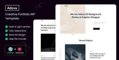
A Creative Portfolio That Finally Sells the Work: My Full Review of Adova
I rebuilt my portfolio three times in two years. Each version looked “designed,” but none of them worked: case studies were dense, the homepage tried to be clever, and the contact page felt like homework. When a studio lead emailed, “Love your style—got a one-pager?” I took the hint and started over with Adova. For clarity, this is the exact item I used: Adova – Creative Portfolio WordPress Theme. Below is a candid, first-person review—half field notes, half teardown—of how Adova behaves in the real world: installing, structuring narrative case studies, tuning mobile performance, and getting from admiration to booked calls without feeling salesy.
Why Adova (and Why Not Another Multipurpose Monster)
Creative portfolios die from excess options. The more knobs a theme exposes, the more likely you’ll substitute novelty for clarity. I chose Adova because its defaults are opinionated where they should be (type scale, spacing rhythm, case-study anatomy) and permissive where it counts (sections you can re-order, quiet accents, gallery variants). My shopping list was simple:
-
A hero that forces a single promise and a single action.
-
A selected-work grid that rewards restraint instead of hoarding.
-
Case-study templates that nudge you toward Context → Moves → Outcome.
-
Typography that respects reading on phones.
-
CTA rhythm that invites instead of insisting.
Adova ticked those boxes in the demo. The test was whether it would hold up with my messy, real content.
Install → Import → Immediate Calm
Adova set up the way I wish all themes did:
-
Theme + child theme installed without warnings.
-
Demo import landed menus, colors, and blocks exactly where previewed.
-
No shortcode archaeology, no “this layout only works with X plugin” traps.
Within an hour, I had a working skeleton: hero → selected work → services (optional) → testimonials → contact. That freed my time for the only hard part—writing and editing.
The Hero: Say One Thing, Mean It
Adova’s hero block has just enough opinion to save you from yourself:
-
Headline (one sentence, large but tastefully set).
-
Support line (11–16 words).
-
Primary CTA (one button).
-
Optional micro-proof (clients/awards/locations) as a muted strip.
My copy after three drafts:
I design calm, conversion-honest interfaces for products and brands.
Selected case studies below; booking two projects per quarter.CTA: See Selected Work. It felt direct, human, and—critically—specific. Adova’s spacing gives that sentence room to breathe; nothing crowds it with glitter.
Selected Work: A Grid That Teaches Taste
The grid is why I stayed with Adova. It looks wrong when you dump twelve projects in it—and that’s a feature. I chose five pieces that show range without whiplash:
-
A SaaS onboarding redesign (reframed upgrade copy, removed ritual pain).
-
A brand system with web typography and a shy color accent.
-
A campaign landing page playbook (A/B structure, five headline stems).
-
A content-first editorial site (accessibility and reading endurance).
-
A mobile checkout tune (error states and debit-card quirks).
Each card got a one-liner, a role tag, and one confident image. The grid’s alignment and gutters make restraint feel expensive.
Case Studies: The Five-Beat Pattern Adova Encourages
Adova’s case layout quietly pushes you toward a narrative that busy stakeholders can scan:
-
Context — one sentence in plain language (“Signups were strong; upgrades weren’t.”).
-
Constraints — time, team, and the unglamorous realities (legacy CSS, no back-end refactor).
-
Key Moves — three bullets with verbs (“re-sequenced pricing,” “tokenized scale,” “labeled errors like a human”).
-
Outcome — a number if you have it; a before/after if you don’t.
-
Proof — one quote, not a wall.
Galleries support detail crops and context shots. Captions are readable; they don’t shrink into apology text. I used Adova’s comparison block twice (before/after) and resisted the third time—sprinkles, not sauce.
Services: If You Sell, Say So (Briefly)
Even if you operate lead-only, people want to know how you fit. I kept three cards:
-
Product Design — flows, components, and design systems.
-
Brand & Site — identity, narrative, and a fast portfolio build.
-
Advisory — audits, hiring help, and “borrow my brain” sessions.
Each with two sentences and a crisp “what you get.” Adova’s icons are quiet; text does the heavy lifting.
A Diary of the Rebuild (Because Deadlines Are Real)
Friday 6:30 p.m. Installed Adova, imported demo, set brand colors (one accent, two neutrals).
7:10 p.m. Wrote the hero; deleted the second button my past self would’ve added.
8:00 p.m. Sketched three case studies in bullets; picked images that earn their place.Saturday 9:20 a.m. Shot a window-lit headshot; Adova’s soft mask made it look intentional.
11:00 a.m. Tuned galleries; cropped to story, not to spectacle.
2:00 p.m. Drafted “How I Work” (four steps, zero jargon).
4:15 p.m. Performance pass—compressed hero, deferred below-fold media.Sunday 10:10 a.m. Wrote two Notes posts (templates, not musings).
Noon Trimmed the contact form to five fields; added one reassurance line.
3:00 p.m. Quiet launch. First inquiry Tuesday; second on Thursday.
Typography & Color: Quiet by Default
Adova’s type scale reads like a well-edited magazine: generous line height, honest sizes, and captions that remain legible on phones. I used one display and one text family, two weights total. The accent color is more whisper than shout; buttons still pass AA contrast comfortably. You’ll be tempted to add a third font. Don’t. Adova looks best when you trust its restraint.
Micro-copy That Pulls Its Weight
-
Buttons: “See selected work,” “Read case study,” “Start a conversation.”
-
Labels: “Timeline,” “Budget range,” “What’s the goal?”
-
Hints: “Two or three sentences is perfect.”
-
Empty states: “New note soon—useful, short.”
-
404: “This page took a wrong turn. Start with the work.”
Short lines look composed with Adova’s spacing; the theme makes clarity feel like craft.
The Contact Page That Doesn’t Scare People
Five fields. One line of reassurance. A tiny “what happens next” box. Adova’s form styling keeps errors beside fields (not in a scolding banner) and never relies on color alone. I added a small “Working with me” sidebar—scope ranges, typical start windows, and how we’ll pick success metrics. Result: fewer back-and-forth emails, better-fit leads.
Performance: Feels Fast on a Real-World Server
On a modest VPS with basic caching and modern image formats:
-
LCP (mobile emulation): ~2.2s pre-tune → ~1.7s after compressing the hero and limiting webfont weights.
-
CLS: low; Adova reserves image space and avoids jumpy carousels.
-
JS weight: lean; no novelty libraries masquerading as “delight.”
Visitors won’t send you Lighthouse screenshots. They will say, “Your site loaded instantly on my phone,” which is the only compliment that matters.
Accessibility: Courtesy at the Core
-
Predictable tab order; visible focus states.
-
Real labels; placeholders don’t cosplay as grown-ups.
-
Contrast meets AA out of the box; I nudged buttons a shade darker for comfort.
-
Motion is restrained; prefers-reduced-motion is honored.
-
Accordions announce state for screen readers.
It’s not just compliance; it’s brand. Polite sites convert.
Mobile: Designed for Thumbs, Not Patience
Adova keeps tap targets tall, headlines calm, and paragraphs digestible. Tables collapse into readable stacks, and the sticky header stays helpful instead of clingy. Case-study galleries swipe smoothly without hijacking scroll. I proofed on a too-bright train at noon—and still wanted to read. That’s the bar.
Editor Experience: Let Non-Devs Ship
I handed the site to a friend who avoids WordPress. She changed a hero verb, swapped a project order, and fixed typography on a caption in twenty minutes without asking me where the blocks live. Adova names controls in human language and previews reliably. This is the difference between a living portfolio and a fossil.
Proof Without Billboards
Two testimonials: short, specific, tagged with role and company. I placed one beneath the grid, one at the end of my strongest case study. Adova’s card style made them feel like references, not billboards. Anything longer than two sentences looked wrong—helpfully so.
The “How I Work” Page That Shrinks Sales Calls
I used Adova’s step blocks to write a humane playbook:
-
Scope — define outcomes and boundaries.
-
Sprints — design, test, adjust; ship weekly artifacts.
-
Decide — name success metrics and what “done” feels like.
-
Handoff — doc, tokens, and a care-and-feeding note.
Four steps, four sentences. Fewer calls asking “what do you actually do?”
Content Strategy: Notes That Pull Their Weight
I don’t blog; I publish notes. Adova’s article layout keeps the reading width kind, centers images without theater, and makes code blocks neat when I share interface snippets. I aim for 300–600 words with a template or outline readers can steal. The first two notes (“Five headline patterns that survive testing” and “Error messages that reduce rage clicks&rdquo
 converted better than any generic “thoughts” post I’ve ever written.
A Short, Opinionated Style Guide I Now Enforce
-
Headlines under six words.
-
One longer paragraph per section for rhythm; keep the rest short.
-
Four images per case study unless complexity proves you need more.
-
One primary CTA per view; demote everything else to text links.
-
Two font weights total; no buffet.
-
If a screenshot needs an arrow, your copy probably needs a verb.
Adova’s defaults make these rules easy to love—and hard to break.
Common Questions (Answered by the Layout)
“Can you show work like our industry?”
Tags under each project lead to related pieces. The grid puts cousins within one click.“How soon can you start?”
Availability lives in the hero subline and repeats on Contact. No surprises.“Do you do development?”
When I do, the Services card says so. When I don’t, it points to partners. Clarity first.
Metrics, Four Weeks After Launch
-
Hero → Selected Work clicks: up after cutting a second button and tightening the line.
-
Case-study completion (scroll depth): improved on narrative-heavy pages; outcomes at top helped.
-
Contact form quality: better—messages referenced specific outcomes, not just “love your vibes.”
-
Mobile bounce: down; tall CTAs and faster hero mattered most.
-
Time from first visit to call: shorter; the “How I Work” page pre-answered awkward questions.
None of these numbers are fireworks. All of them pay the rent.
Pitfalls Adova Helped Me Avoid
-
Widget soup — no chat bubbles or social ribbons on case studies.
-
Logo walls — one line of micro-proof is enough.
-
Font creep — two weights keep the vibe adult.
-
Carousels everywhere — one hero image per page; that’s it.
-
CTA confusion — one action per view wins.
The theme’s discipline is your taste coach.
Category Scouting While Planning
Before I committed to my final page order, I skimmed broader theme patterns to calibrate how proof, features, and CTAs are staged on conversion-minded designs. For a quick, high-level view when aligning with clients or collaborators, a category like WooCommerce Themes is useful for pattern spotting and tone checks: WooCommerce Themes. Even if you’re not selling products, the way those layouts frame value can sharpen your portfolio storytelling.
Maintenance Routine That Doesn’t Eat Weekends
-
Update one case-study image per quarter; swap any that stop earning space.
-
Refresh the hero subline seasonally (availability, focus area).
-
Publish one Note monthly with a template people can steal.
-
Re-audit Contact every two months: are the five fields still the right five?
-
Keep Core Web Vitals honest—compress the hero, avoid weight creep.
With Adova, each change feels like tidying a desk, not moving house.
Who Adova Is For (and Who Will Fight It)
Choose Adova if you…
-
Want a portfolio that sells with calm authority.
-
Prefer narrative case studies over maximalist galleries.
-
Need non-developers to keep pages current.
-
Care about speed, readability, and accessible defaults.
You’ll fight Adova if you…
-
Want kinetic spectacle and five competing fonts.
-
Insist on carousels and popups above the fold.
-
Measure success by novelty, not clarity.
Adova is for professionals who believe design is how something works when someone is tired, busy, and on a phone.
A Practical Launch Checklist (Steal It Whole)
-
Write a one-sentence promise; delete the second CTA.
-
Pick five projects; lead with the clearest outcome.
-
Draft case studies as five beats before you touch images.
-
Limit to four images per study unless complexity argues back.
-
Add two short testimonials; skip logo walls.
-
Trim Contact to five fields; write a reassurance line and “what happens next.”
-
Compress the hero; load two font weights max.
-
Test with a stranger; if they hesitate, rewrite the headline.
-
Revisit the hero tomorrow; cut one adjective.
-
Ship. Then iterate verbs, not paragraphs.
Final Verdict
Adova doesn’t chase tricks. It provides rails for clarity: a hero that introduces you without theater, a grid that curates without crowding, case studies that persuade without speeches, and a contact path that respects time. Most portfolios collapse under their own ambition; this one stands because it knows when to stop. If your current site is a pretty scrapbook that rarely starts a real conversation, Adova is the frame that turns it into a working tool.
I rebuilt in a weekend. The site has been quietly doing its job ever since—opening the door, setting the tone, and letting the work make the case.
-