Meipaly Rebuild Notes: Turning a Messy Agency Site Into a Flow
-
A Quiet Rebuild Log: What I Changed When an Agency Website Stopped Working
I didn’t rebuild the agency site because it “looked old.” I rebuilt it because it stopped doing its job in small ways that were easy to ignore until they weren’t.
Leads were still coming in, but the quality dropped. People who filled the form asked questions that the website already answered—pricing expectations, service scope, timelines, whether we do ongoing retainers or one-off projects. The site had the information, yet it wasn’t being used.
That’s usually a structure problem, not a content problem.
I also noticed another pattern: on mobile, people scrolled quickly, tapped once or twice, then left. That doesn’t always mean the page is bad. It often means it’s unclear what the page wants them to do next.
This post is written like a long work journal, from the perspective of the person who has to maintain the website after launch. I’m not listing features or describing a demo. I’m describing decisions, sequencing, and what changed after the rebuild was live for a while.
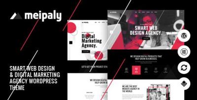
The theme I used as the base was Meipaly - Digital Services Agency WordPress Theme. I’m mentioning it up front because the rebuild starts there, but the real story is how I used the base to make the site calmer, clearer, and easier to run.
The Real Problem: The Site Was Asking Visitors to Think Too Much
Agency sites are tricky because the visitor intent is often mixed:
-
some people already know what they need (they’re price-checking and credibility-checking)
-
some people have a vague problem (they want guidance, not jargon)
-
some people are comparing multiple agencies quickly
-
some are returning visitors who just want to contact you again
A lot of agency websites fail because they try to “explain everything” to everyone at once. The homepage becomes a wall of sections: services, case studies, testimonials, process, team, tools, awards, blog, FAQs—plus multiple CTAs competing with each other.
On desktop, this can still look fine. On mobile, it becomes exhausting.
So my first internal goal was simple:
Reduce cognitive load. Make the site feel like it has one direction.
Not more content. Not louder copy. Less confusion.
How I Decided What to Fix First (And Why I Didn’t Start With Design)
I used a decision flow that I’ve learned to trust:
-
Navigation and page hierarchy first
-
Service page structure second
-
Case study/story pages third
-
Contact flow and friction fourth
-
Only then: styling refinements
Most rebuilds fail because we start with styling and then discover later that the structure doesn’t support the business. You can polish a confusing structure, but it stays confusing—just prettier.
So before touching any layout, I mapped the site’s job into a few routes.
The routes I used
-
“I want to know what you do” → Services overview → Service detail
-
“I want proof you’ve done this” → Case studies → One case study → Contact
-
“I need an estimate” → Service detail + scope clarity → Contact with context
-
“I’m returning” → Contact and a fast path to relevant pages
Then I checked where the old site was failing those routes:
-
Services were described, but not framed for decision-making.
-
Case studies existed, but were buried and inconsistent.
-
Contact page existed, but didn’t reduce uncertainty.
-
Mobile pages were readable, but too long and too repetitive.
The Mistake I Avoided: Rebuilding the Homepage as a “Showcase”
In agencies, we love showing work. That’s natural. But a homepage showcase is not always the best entry point.
Many visitors land from Google directly on a service page or a case study. The homepage is often a “confirmation page”: people go there after landing elsewhere to verify legitimacy.
So I gave the homepage a limited job:
-
state what we do, in plain language
-
show a short credibility signal
-
route people quickly to services and proof
-
provide one clear next step
Then I stopped. I didn’t let the homepage become an endless scroll.
This decision alone reduced my maintenance burden later. A heavy homepage becomes a performance and update liability. A simpler homepage stays stable.
Services Pages: I Rewrote Them as “Scoping Pages,” Not Brochures
Here’s what I learned: visitors rarely read service pages to admire them. They read them to reduce risk.
They want to know:
-
Is this relevant to my situation?
-
What’s included and what’s not?
-
What does the process feel like?
-
How do we begin without wasting time?
So I rebuilt service pages around scoping clarity.
Not in a “feature list” way—more like an internal document translated into human language.
The structure I settled on (and reused)
-
a short, plain opening paragraph: who this service is for
-
a “what you’ll get” section written as outcomes, not claims
-
a “how we work” section that describes steps calmly
-
a “what we need from you” section (this prevents low-quality leads)
-
a short FAQ that addresses real objections
-
one action step: contact with context
The most important part was “what we need from you.” Many agency leads are low quality because the website makes it too easy to contact without thinking. That sounds good until you’re drowning in vague messages.
When I added a calm “here’s what helps us estimate properly,” lead quality improved without any marketing tricks.
Case Studies: I Stopped Writing Them Like Stories and Started Writing Them Like Evidence
A case study is not a blog post. It’s evidence.
The old site had “portfolio” pages that looked nice but didn’t answer:
-
what was the initial state?
-
what constraints existed?
-
what decisions were made?
-
what changed after launch?
I rewrote case study pages to be consistent. Not longer, just clearer.
I also simplified the way visitors find case studies:
-
case studies should be reachable from services pages
-
services pages should point to 1–2 relevant examples
-
case studies should point back to service relevance
That created a loop: people could verify, then decide.
I didn’t add tables. I didn’t add “before/after” gimmicks. I made the narrative linear and factual.
The “Ops” Perspective: What Makes an Agency Site Hard to Maintain
Agency sites change constantly:
-
new services appear (“now we do Webflow,” “now we do CRO,” etc.)
-
team members change
-
case studies are added, removed, revised
-
pricing policies shift
-
lead forms evolve
The worst kind of theme base is one that forces custom hacks for normal updates. Because those hacks become fragile, and every update becomes risky.
So I evaluated Meipaly mostly by how it behaved under boring work:
-
adding new pages without layout drift
-
editing sections without breaking spacing
-
ensuring mobile looks consistent without extra CSS
-
keeping typography consistent across templates
-
updating plugins without “mystery changes”
That’s the kind of stability I care about. Not “wow factor.”
User Behavior Observations: What People Actually Did After the Rebuild
After launch, I watched behavior quietly for a couple of weeks.
The patterns were predictable, but still useful:
-
Mobile visitors scroll until they see a clear route.
If they don’t see it quickly, they leave. -
People click “About” only after they trust the work.
“About” is rarely a first stop. -
Pricing anxiety is real even when you don’t show prices.
Visitors still want boundaries and expectations. -
If the contact step feels like work, fewer people contact you, but the leads are better.
This is often a net positive.
The biggest measurable improvement wasn’t traffic. It was lead quality: fewer “I need a website” messages, more “I need X with Y constraints” messages.
A Common Misconception I Corrected: “We Need More Sections to Look Big”
Small agencies often try to look big by adding more sections, more claims, more badges, more counters.
But visitors don’t trust big-looking sites. They trust coherent sites.
I removed sections that were “identity theater”:
-
repeated slogans
-
generic value statements
-
redundant testimonials that didn’t say anything specific
-
long tool lists that don’t matter to buyers
The site became shorter, calmer, and easier to scan. It felt more mature, not smaller.
The Quiet Technical Side: Performance and Mobile Stability
I didn’t chase a perfect score. I chased predictability.
My rule is boring:
-
keep pages structurally simple
-
keep images optimized
-
avoid heavy hero elements
-
limit font weights
-
reduce plugin overlap
Many agency sites get slow because they keep piling on “small things” (chat widget, popup, analytics, form tracker, animation library). Each is manageable alone. Together, they make the site unstable.
After the rebuild, the site felt faster mainly because the page structure was less noisy and the modules were fewer.
One Structural Choice That Helped SEO Without “SEO Tricks”
I treated internal linking as navigation, not as SEO.
-
service pages naturally link to relevant case studies
-
case studies naturally link back to services
-
the menu structure stays consistent
-
category structure stays clean
I didn’t add “related posts” everywhere. I didn’t do keyword stuffing. I just made the site easier to move through.
For managing theme assets and keeping taxonomy tidy on the admin side, I kept everything under a clean WordPress Themes structure so pages remain easy to group and maintain.
A Decision I Made Late: I Stopped Tweaking Layout and Started Editing Microcopy
Once the structure was stable, I did the part that people ignore: microcopy.
Microcopy is the small text that reduces friction:
-
button labels
-
form field hints
-
short “what happens next” sentences
-
“response time” expectations
-
“what to include in your message” notes
This made the contact flow feel calmer. People hate uncertainty. Microcopy reduces it.
I didn’t make it “friendly marketing.” I made it practical.
What I Would Do Differently Next Time
No rebuild is perfect. Next time, I’d tighten a few steps:
-
I would lock service page templates earlier to prevent page-by-page variation.
-
I would build the case study structure first before writing new ones.
-
I would set a stricter homepage section budget from day one.
-
I would create a simple internal “update checklist” for non-technical editors.
This is not about the theme. It’s about avoiding long-term chaos.
Closing Notes: The Outcome I Actually Wanted
I didn’t want an agency site that “looks impressive.” I wanted one that behaves predictably:
-
visitors can route themselves quickly
-
the site doesn’t ask people to think too much
-
mobile scanning feels natural
-
edits don’t break layouts
-
updates are boring
-
leads arrive with more context and fewer misunderstandings
That’s the kind of professional that lasts.
If you maintain agency sites long enough, you learn that the best signal of a successful rebuild is not a compliment. It’s fewer questions that shouldn’t be asked, fewer pages that need explanation, and fewer nights spent undoing small breakages after “just one more tweak.”
That’s what this rebuild aimed for: less drama, more flow.
-