Living With Lilac: Quiet Notes on Running a Beauty Store Site
-
A Calm Rebuild Log: What Changed When I Rebuilt a Beauty Shop Website
The message that triggered this rebuild was short and a little painful:
“People browse, but they don’t add to cart.”
That statement is common in eCommerce, but it hides multiple problems. Sometimes it’s product pricing. Sometimes it’s traffic quality. Sometimes it’s checkout friction. In this case, it was simpler: the site made browsing feel like work.
On desktop it looked fine. On mobile it felt “busy.” Not visually loud, but structurally tiring: too many repeated blocks, too many “almost the same” category pages, product cards that didn’t guide the eye, and a navigation flow that required visitors to keep re-orienting themselves.
This post is written as a long operational journal—what I did, the order I did it in, and what I observed after the site had been live for a while. I’m not going to list features or describe a demo. I’m going to talk about structure, browsing behavior, and maintenance decisions that kept the rebuild quiet.
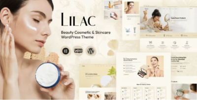
The theme I used as the base was Lilac - Beauty Cosmetics Shop WordPress Theme. I’m mentioning it early because it’s the foundation, but the outcome depended more on how I used it than on what it can do on paper.
The Real Problem: “Beauty Shopping” Is Mostly Browsing, Not Searching
Many store owners build as if visitors know what they want. In beauty and cosmetics, that’s often false. People discover.
They browse:
-
“something gentle” rather than a specific brand
-
“a cleanser for sensitive skin” rather than a precise SKU
-
“a gift set” rather than a single product
-
“something new” rather than a known item
Browsing is a fragile experience. If it feels confusing, visitors don’t “rage quit.” They drift. They scroll less. They open fewer product pages. They stop adding items because the store doesn’t help them narrow choices.
So I framed the rebuild around one practical goal:
Make browsing feel lighter and more guided, especially on mobile.
Not more “marketing.” Not more “proof.” Less effort.
How I Decided What to Fix First (And Why I Didn’t Start With Homepage Design)
When a store underperforms, it’s tempting to redesign the homepage. But the homepage is rarely where the decision happens. For cosmetics, decisions often happen here:
-
category pages
-
collection pages (e.g., “new arrivals,” “best sellers”)
-
product detail pages
-
cart and checkout pages
So my decision flow looked like this:
-
Category structure and filtering logic (even if minimal)
-
Product listing page clarity (cards, spacing, scanning)
-
Product page decision cues (not marketing, cues)
-
Cart/checkout friction
-
Only then: homepage and branding polish
I started with the pages that most visitors use repeatedly. If those pages are calm, the whole store feels calmer.
Step One: Fixing the Category Map Before Touching Visuals
The old store had categories that made sense internally but not externally. Internally, they matched supplier tags. Externally, they didn’t match how people shop.
A classic example in cosmetics:
-
Internal: “Skincare / Face / Serums / Vitamin C / Brightening”
-
Visitor intent: “I want something to reduce dullness” or “I want a serum for morning routine”
Visitors aren’t taxonomy experts. They’re tired humans with a small screen.
So I rebuilt the category map around shopping questions:
-
what product type it is
-
what routine step it belongs to
-
what concern it addresses
But I did this conservatively, because over-taxonomy creates new problems.
The rule I used
If a category name needs explanation, it’s not a category; it’s a filter.
This reduced category clutter. It also improved maintenance because staff aren’t forced to guess between similar categories when adding products.
Step Two: Product Listing Pages That Don’t Exhaust People
This is where many stores quietly fail: product grids are visually “fine” but psychologically tiring.
What makes a product grid tiring?
-
inconsistent image crop ratios
-
too many badges competing for attention
-
price, sale price, rating, and short descriptions all crammed
-
card spacing that makes everything feel dense
-
a grid that doesn’t create a predictable scanning rhythm
So I treated product listing pages like a reading interface.
What I optimized for
-
visitors should be able to scan a page in 5–10 seconds and shortlist 2–3 items
-
cards should feel uniform (so the product differences stand out, not the layout differences)
-
the grid should not look like a spreadsheet
This is where Lilac helped: it gave me a consistent, store-oriented base so I could focus on rhythm and hierarchy rather than rebuilding everything from scratch.
Step Three: Product Pages as “Decision Pages,” Not Descriptions
A beauty product page has an unusual job: it needs to answer practical questions without sounding like a brochure.
People want:
-
how to use it (quickly)
-
who it’s for
-
what to expect (realistic)
-
key ingredients or texture notes (depending on niche)
-
shipping/returns info (quietly accessible)
-
trust cues (not loud claims)
The old store had long product descriptions that tried to cover everything. On mobile, long paragraphs become fog.
So I rewrote product page structure to be:
-
short opening summary (one screen)
-
usage notes (small)
-
fit notes (“good if you…”)
-
care notes (skin sensitivity, patch test reminders if relevant)
-
shipping/returns in a predictable place
This isn’t a feature list. It’s a decision path.
And importantly: I made it consistent across products. Consistency reduces doubt.
The Mistake I Avoided: Stuffing the Homepage With Everything
Beauty stores often want the homepage to show:
-
best sellers
-
new arrivals
-
trending
-
promotions
-
blog
-
testimonials
-
social feed
-
brand story
-
banners
-
category tiles
It looks like “a real shop,” but on mobile it becomes noise.
So I gave the homepage one job: routing.
-
a calm header with a clear shop path
-
a small set of key collections (not endless)
-
one credibility section (not five)
-
then stop
Everything else belongs in category and product pages where the visitor is already in shopping mode.
User Behavior Observations After Launch: What People Actually Did
After launch, I watched behavior and tried not to overreact to daily fluctuations. I looked for patterns across two weeks.
Here’s what I saw:
-
Mobile visitors used category pages more than search.
The store needed browsing more than “search UX tricks.” -
People opened more product pages when the grid felt calmer.
A calm grid increases curiosity. -
Add-to-cart improved when product pages answered usage questions quickly.
Not with claims—just with clarity. -
People still abandoned carts, but later in the flow.
That’s a good sign: it means earlier pages aren’t causing immediate doubt.
A Quiet Correction: Trust Cues Without “Proof Theater”
Cosmetics sites can easily look untrustworthy if they push too hard:
-
too many “limited time” prompts
-
exaggerated adjectives everywhere
-
endless popups
-
heavy persuasion sections
Instead, I used quiet trust cues:
-
consistent product information structure
-
predictable shipping/returns placement
-
clear ingredient/usage notes when relevant
-
a stable, readable mobile layout
-
fewer distractions
Visitors trust calm systems.
This is why the rebuild felt like “less work” to use even though the content did not explode in length.
The Ops View: Maintenance Rules That Prevent Slow Drift
This is the part most people ignore: after a rebuild, stores drift back into chaos because staff add products inconsistently.
So I set simple admin rules:
-
product titles follow one format
-
images use one ratio and consistent background style
-
product descriptions follow the same structural template
-
tags are limited to avoid taxonomy bloat
-
if a new category is suggested, ask: is it truly a category or just a filter?
These rules keep the store calm six months later.
Light Technical Notes: Performance Without Turning It Into a Project
I kept performance work practical:
-
optimized images first
-
limited font weights
-
reduced heavy homepage modules
-
avoided stacking too many third-party scripts
-
kept caching predictable
In many eCommerce setups, the “theme” gets blamed for slowness. But most slowness comes from:
-
unoptimized images
-
too many add-ons
-
too many tracking scripts
-
heavy sliders and popups
With a stable base, you can keep performance in a “maintenance lane” instead of making it a constant firefight.
Where I Put My Attention Instead of “Design Tweaks”
Once structure was stable, I focused on microcopy. Not marketing copy—microcopy.
Examples:
-
button labels that indicate what happens next
-
brief notes near variant selectors
-
a simple line on shipping expectations
-
return policy clarity without being defensive
Microcopy reduces uncertainty. Uncertainty is a conversion killer in beauty shopping.
Keeping Theme Organization Clean on the Backend
This is minor but important for long-term operations: keep store assets organized so you don’t create duplicate structures or messy navigation over time.
For theme-related organization and a clean taxonomy approach, I kept the site’s theme grouping disciplined under WordPress Themes to avoid scattering categories across inconsistent naming.
When you run multiple product uploads, this discipline prevents subtle SEO and UX issues later.
What I’d Do Differently Next Time
No rebuild is perfect. Here’s what I’d tighten next time:
-
lock the product description template earlier
-
decide category vs filter boundaries sooner
-
design the “gift flow” as its own route (beauty shoppers love gift routes)
-
formalize a monthly content hygiene checklist (images, taxonomy, old promotions)
These are boring steps, but boring steps create stable stores.
Closing: The Outcome I Actually Wanted
I didn’t want the store to look “fancier.” I wanted it to feel easier.
-
browsing feels guided rather than dense
-
product pages answer practical questions quickly
-
mobile doesn’t feel like scrolling through a wall
-
admins can upload products without messing up structure
-
the store stays calm after updates
That’s the kind of improvement that lasts.
When a cosmetics shop site works, it doesn’t shout. It quietly makes browsing feel natural—until the visitor has enough confidence to choose, add to cart, and move on without second guessing every click.
-