Long-Term Maintenance Notes from an Architecture Studio Website
-
Rebuilding an Interior Design Website with a Clear Structural Mindset
The moment I realized our interior design website needed to be rebuilt was not dramatic. There was no crash, no sudden drop in traffic, and no urgent client complaint. Instead, it happened during a routine update. I was trying to add a recently completed residential project, and halfway through the process, I stopped. Not because the content was unfinished, but because I was unsure where it should live and how it should be presented.
That hesitation mattered. It meant the site no longer felt intuitive, even to the people maintaining it.
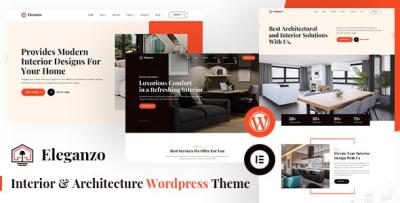
At that time, we were already browsing different structural approaches commonly used across Business WordPress Themes, not to chase trends, but to understand how other studios organized their work. During this process, we decided to rebuild using Eleganzo - Interior & Architecture WordPress Theme. This article is not an endorsement and not a showcase. It is a long-term, first-hand account of what changed after that decision and how the site behaved once it was no longer new.
The Original Problem Was Not Design Quality
Before the rebuild, our site looked acceptable. Clients did not complain about aesthetics. Pages loaded, images displayed correctly, and contact forms worked. From the outside, nothing was obviously broken.
The issue was internal. As administrators, we felt friction at every step. Projects were organized inconsistently. Some lived as blog posts, others as custom pages. Navigation evolved over time without a clear hierarchy. The site reflected years of incremental decisions rather than a single, coherent structure.
This affected daily operations more than we expected. Updating content took longer. Explaining the backend structure to new team members became difficult. Even deciding what not to publish required unnecessary discussion.
Starting the Rebuild from Constraints, Not Features
When we decided to rebuild, we deliberately avoided feature comparisons. Instead, we listed constraints.
We wanted:
-
One predictable structure for all projects
-
Minimal layout decisions during content entry
-
A homepage that introduced the studio without summarizing everything
-
A system that could scale quietly as the portfolio grew
Eleganzo appealed to us early because it appeared to impose a clear rhythm. Pages followed a consistent flow. Content blocks felt intentional rather than decorative. That sense of restraint aligned with how we wanted the site to behave long-term.
The First Week: Learning to Not Customize
After installation, our instinct was to adjust typography, spacing, and color usage immediately. We resisted that urge.
For the first week, we worked entirely within the default structure. We migrated three older projects, one medium-sized commercial space, one residential interior, and one conceptual architectural study. These projects varied significantly in tone and content length.
What surprised us was how little adjustment they required. The structure absorbed the differences naturally. This suggested that the theme had been designed around real-world content variability rather than idealized demos.
Content Flow Matters More Than Visual Impact
One of the biggest lessons from this rebuild was understanding how visitors actually move through an interior or architecture website.
Most visitors did not start on the homepage. They landed on individual project pages from search results or shared links. From there, they scanned visuals, read selectively, and then looked for contextual signals. What else has this studio done? Is this project part of a larger body of work?
By enforcing consistent project layouts, the site reduced cognitive effort. Visitors did not need to relearn how to read each page. This predictability encouraged exploration rather than exit.
Administrative Calm as a Success Metric
After launch, we paid attention to something that analytics tools do not measure well: administrative calm.
Weekly updates no longer triggered layout checks. Editing older projects felt safe. We stopped duplicating pages just to preserve formatting. The backend became something we trusted.
This trust had practical consequences. We updated the site more often. We refined copy gradually instead of postponing changes. The site became a living system rather than a static archive.
Observations from Visitor Behavior
We did not chase metrics aggressively, but we did observe patterns.
Visitors spent more time moving between project pages. Fewer sessions ended after a single page view. This suggested that the internal linking logic and page flow encouraged continued browsing without explicit prompts.
Importantly, this happened without adding banners, sliders, or calls to action. The structure itself guided behavior.
Avoiding Common Architecture Website Pitfalls
In hindsight, the rebuild helped us avoid several mistakes we had made before.
We stopped over-explaining. Architecture and interior design work often suffers from excessive narrative. This time, we let visuals and concise context coexist without competing.
We avoided homepage overload. Instead of summarizing every service and philosophy statement, the homepage became a gateway rather than a manifesto.
We also resisted adding third-party plugins to solve imagined problems. Fewer moving parts meant fewer maintenance concerns.
Light Technical Notes from Long-Term Use
From a technical standpoint, the site remained stable. Image-heavy pages behaved consistently across devices. We did not encounter layout shifts that required constant CSS adjustments.
Performance remained predictable. More importantly, updates did not introduce unexpected behavior. This reliability mattered more to us than minor speed optimizations.
Team Onboarding Became Easier
One unexpected benefit of the new structure was onboarding.
When new team members joined, explaining how the website worked took minutes instead of hours. The structure was self-explanatory. Once someone understood one project page, they understood them all.
This reduced dependency on specific individuals and lowered operational risk.
How the Site Aged Over Time
Several months after launch, the site no longer felt new. This was the real test.
Older projects still looked relevant. Newer projects integrated smoothly. There was no visible line between content created before or after the rebuild. This continuity suggested that the structure was flexible enough to accommodate growth without visual drift.
Final Reflections
Rebuilding the site was less about choosing a theme and more about choosing restraint.
By accepting structural constraints, we reduced noise. By prioritizing clarity over novelty, we made the site easier to maintain. The result was not a dramatic transformation, but a quieter one.
The site now supports our work rather than competing with it. For an interior and architecture studio whose portfolio evolves over years, that balance matters more than initial impact.
I do not consider this setup final. No site ever is. But for now, it feels sustainable, and that alone justifies the rebuild.
-