Sility HTML Template Review: A Developer's Deep Dive into Your
-
Sility HTML Template Review: A Developer's Deep Dive into Your Next Digital CV
Your online resume is your digital handshake. In a sea of cookie-cutter LinkedIn profiles and generic PDF resumes, a dedicated personal website is a power move. It demonstrates technical literacy, an eye for detail, and a commitment to your professional brand. The problem? Building one from scratch is time-consuming. This is where templates come in, and the one on my workbench today is the Sility - vCard, CV & Resume HTML Template. It promises a sleek, modern, and responsive vCard-style site without the overhead of a full-blown CMS. But does it deliver for a professional who knows their way around a code editor? I’m tearing this template down to its HTML bones to see if it's a solid foundation or just a pretty façade.
We're going to dissect its design, audit the code quality, and then walk through a real-world installation and customization process. This isn't a sales pitch; it's a technical appraisal for developers, designers, and ambitious professionals who aren't afraid to get their hands a little dirty with code to achieve a superior result.
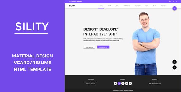
Part 1: First Impressions & Design Analysis
Upon downloading and unzipping the package, the first thing a developer notices is the file structure. Sility presents a clean, conventional layout. You have your root `index.html` and other page templates, alongside neatly organized folders for `css`, `js`, `images`, and `webfonts`. There are no surprises here, which is a good thing. A predictable structure means you can find what you need without a map. The package includes multiple demo variations (light, dark, different color schemes), which is a nice touch, offering a starting point that might be closer to your desired end-state.
Aesthetic & User Experience (UX) Critique
Sility adopts a popular single-page vCard layout. The screen is typically split, with a static panel on the left holding the primary photo, name, and navigation, while the main content area on the right scrolls through sections like "About Me," "Resume," "Portfolio," and "Contact." It’s a tried-and-true format that works well for presenting a linear career narrative.
The design itself is clean and minimalist. The typography is legible, with a clear hierarchy between headings and body text. The default font choices (usually Poppins or a similar sans-serif from Google Fonts) are safe and professional. The use of whitespace is generous, preventing the layout from feeling cramped, which is a common failing in less-polished templates. The iconography is subtle and effective, using a library like Font Awesome or a custom icon font to guide the user without being distracting.
However, the design isn't groundbreaking. You've likely seen variations of this layout before. Its strength lies not in its uniqueness, but in its execution of a familiar pattern. It's a double-edged sword: it feels instantly intuitive to a visitor, but it might not stand out in a crowd of other vCard websites. For a developer or a corporate professional, this is often a plus. They need clarity and professionalism, not avant-garde art. For a cutting-edge graphic designer, it might feel a bit too conservative.
Responsiveness Under Scrutiny
I fired up my browser's developer tools to put the responsiveness through its paces. On a standard desktop view, everything aligns as expected. As the viewport shrinks to tablet size, the layout holds up well. The two-column design gracefully transitions into a single-column stack. The left-hand static panel typically moves to the top, becoming a header for the mobile view.
This is where I found a minor point of contention. On some smaller mobile viewports (like an iPhone SE), the top header can feel a bit chunky, consuming valuable screen real estate above the fold. A developer could easily tweak the media queries to reduce the padding or font sizes at these specific breakpoints, but out of the box, it's a small compromise. The navigation collapses into a standard hamburger menu, and the interactive elements like portfolio filters and contact forms resize correctly. Overall, the responsive implementation is solid, hitting all the major breakpoints without significant layout shifts or content overflow issues.
Part 2: Under the Hood - A Code Quality Teardown
A pretty face is nothing without good bones. Here's where we separate the professional-grade tools from the amateur hour projects. How is Sility built?
HTML Structure & Semantics
Opening `index.html` in VS Code, the first thing I check for is semantic HTML5. Sility does a decent job here. You'll find `
`, `