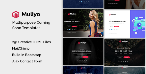
Muliyo "Coming Soon" Template: A Developer's Deep Dive and Tech
-
Muliyo "Coming Soon" Template: A Developer's Deep Dive and Technical Review
A "coming soon" page is one of the most deceptively simple projects a developer can tackle. On the surface, it's a static page with a timer. Dig a little deeper, and it becomes a critical pre-launch marketing tool: a hub for capturing leads, building hype, and establishing brand identity before day one. The market is saturated with options, but today we’re putting one specific contender on the test bench: the Muliyo - Multipurpose Coming Soon HTML Template. We're going to tear it down to the studs, examining its code, its design flexibility, and its real-world utility. This isn't just about whether it looks good; it's about whether it’s a tool that respects a developer's time and provides a solid, maintainable foundation for a project's critical first impression.
Part 1: The First Impression - Design, UX, and Visuals
Out of the box, Muliyo presents a clean, modern, and frankly, safe aesthetic. This isn't a criticism. A "coming soon" template should be a chameleon, capable of adapting to a brand's identity, not imposing its own. Muliyo achieves this with a focus on strong typography, generous whitespace, and a component-based layout that feels familiar and intuitive. It offers several demos, each showcasing a different primary use case: static image backgrounds, video backgrounds, and image sliders. This immediately signals a degree of flexibility.
Component Breakdown and Analysis
A template like this lives or dies by the quality of its core components. Let's break down what Muliyo offers.
The Countdown Timer: This is the centerpiece of any launch page. Muliyo employs a standard JavaScript-powered circular timer. Visually, it's effective. The circles representing days, hours, minutes, and seconds are easy to read and provide a clear visual indicator of depleting time. From a UX perspective, it creates a tangible sense of urgency. We'll dig into the specific JS implementation later, but on the surface, it's a solid, professional-looking component that avoids the cheesy, low-budget feel of simpler text-only counters.
Subscription and Contact Forms: The template includes a prominent email subscription form, which is non-negotiable for a pre-launch page. The markup is straightforward: a simple input field for the email address and a submit button. There is no client-side validation out of the box, which is a slight miss. A developer will need to add a `required` attribute and perhaps a regex pattern for basic email format checking. The included full-contact form is similarly clean, with fields for name, email, and a message. A key point here is that these are just the HTML front-end. They look the part, but they do nothing on their own. You will need to wire them up to a backend service, a topic we'll cover in the installation guide.
Background Variations: This is where Muliyo demonstrates its multipurpose claim.
- Image Background: The simplest and most performant option. The demo uses a high-quality, full-screen image. The CSS correctly uses `background-size: cover;` to ensure the image scales properly across different viewports.
- Slider Background: This version uses a subtle Ken Burns effect, slowly panning and zooming across a series of images. It’s more dynamic than a static image without being as resource-intensive or distracting as a video.
- Video Background: The most visually impressive option. Muliyo uses a self-hosted HTML5 `
Responsiveness and Cross-Device Testing
Saying a template is "responsive" is table stakes in modern web development. The real test is how it responds. I resized my browser viewport from 320px (small mobile) up to 2560px (ultrawide desktop) to see where the seams might show.
The results are generally positive. The single-column layout on mobile is logical and legible. The countdown timer's circles stack vertically, which is a sensible adaptation for narrow screens. The forms remain usable, and the core content is prioritized correctly. On tablet-sized screens, the layout makes good use of the extra horizontal space without feeling sparse. On large desktop monitors, the centered content block prevents text lines from becoming unreadably long.
However, I did notice one minor area for improvement. On very wide screens, the social media icons at the bottom can feel a bit lost in the vast empty space. A developer might consider wrapping the main content in a container with a `max-width` to provide a more constrained and focused presentation on ultrawide displays. It’s a minor tweak, but one a discerning client might notice.
Part 2: Under the Hood - A Developer's Code Review
A beautiful facade can hide a messy foundation. Let's unpack the Muliyo ZIP file and analyze the code quality, structure, and dependencies. This is where we separate the professional tools from the hobbyist themes.
File and Directory Structure
Upon unzipping, the file structure is clean and what you'd expect from a professional template.
/muliyo
├── css/
│   ├── bootstrap.min.css
│   ├── style.css
│   └── ... (other plugin CSS)
├── js/
│   ├── jquery.min.js
│   ├── main.js
│   └── ... (other plugin JS)
├── images/
│   └── ... (demo images)
├── index.html
├── index-slider.html
└── index-video.html
This is a logical and maintainable structure. Separating CSS, JavaScript, and image assets is standard practice. The inclusion of different `index-*.html` files for each background variation makes it easy to pick your starting point without having to comment out large chunks of code.
HTML Markup Analysis (`index.html`)
Opening `index.html` reveals the template's skeleton. The code is built on the Bootstrap 4 framework, which immediately tells me a few things: it's going to have a robust and familiar grid system, and it might carry some dependency weight.
Semantics and Structure: The document uses a proper HTML5 doctype and structure. However, it leans heavily on `
` elements with Bootstrap classes (e.g., ``, ``). While this is idiomatic for Bootstrap, I would have liked to see more semantic elements like ``, ` `, and `