Gray WordPress Theme Deep Dive: A Developer's Review and No-Non
-
Gray WordPress Theme Deep Dive: A Developer's Review and No-Nonsense Installation Guide
The single-page portfolio is a staple for freelancers, designers, and creatives. It's a digital business card, a curated gallery, and a direct line to potential clients, all rolled into one efficient, scrollable experience. The market is saturated with options, but the promise of minimalism and elegance often draws the eye. This is the space where the Gray - Personal Portfolio WordPress Theme aims to make its mark. It presents itself as a clean, modern, and straightforward solution for showcasing creative work. But in a world of page builders and complex frameworks, how does it actually perform? This isn't just a surface-level overview; it's a technical teardown and a practical guide from the perspective of a developer who has seen countless themes, both brilliant and bloated. We'll dissect its design, inspect its technical foundation, walk through a real-world installation, and deliver a final verdict on who should use it and who should steer clear.
Part 1: The First Impression - Aesthetics and Design Philosophy
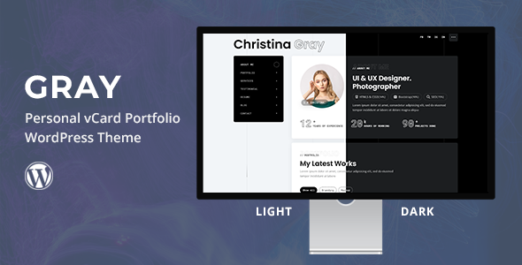
Out of the box, Gray delivers on its minimalist promise. The demo presents a refined, almost stark aesthetic built on a foundation of generous white space, strong typography, and a monochromatic color scheme punctuated by a single accent color. This is a design that understands its purpose: to get out of the way and let the portfolio content take center stage. There are no distracting animations, no overly complex parallax effects, just a clean, professional canvas.
The layout is a classic single-page scroll, divided into logical sections: a bold hero introduction, an "About Me" segment, services, portfolio, and a contact form. Navigation is handled by a "sticky" header that smoothly scrolls the user to the corresponding section on the page. This is an effective and intuitive user experience for a compact portfolio. It eliminates the friction of navigating multiple pages and presents a complete narrative of who you are and what you do in one cohesive flow.
Typography is a critical component of minimalist design, and Gray handles it competently. The default font pairings (typically a modern sans-serif like Poppins or Inter) are legible, stylish, and provide clear visual hierarchy. Headings are bold and impactful, while body copy is sized for comfortable reading. The spacing, or negative space, is perhaps the theme's strongest visual asset. Sections are well-defined, and elements have room to breathe, preventing the layout from feeling cramped, even when populated with content. This deliberate use of space guides the user's eye and contributes to a feeling of calm and professionalism.
The target audience is clearly the individual creative. A web developer, UI/UX designer, photographer, or copywriter could adapt this theme with minimal effort. Its structure is perfectly suited for a personal brand that needs to make a quick, strong impression. The design doesn't try to be a multi-purpose corporate theme; it knows its niche and serves it well. This focus is a strength, but it's also its primary limitation—a topic we'll revisit later.
Part 2: Under the Hood - A Technical Teardown
A beautiful design is only half the story. A theme's long-term value is determined by its code quality, performance, and flexibility. This is where we pop the hood and examine the engine powering the Gray theme.
Code Quality and Dependencies
Upon inspecting the theme files, the structure is fairly standard for a modern theme built to be sold on a marketplace. It properly enqueues its styles and scripts using `wp_enqueue_style()` and `wp_enqueue_script()`, which is a fundamental best practice. It also makes use of a "core" plugin, often bundled as "Gray Core" or similar. This is a common and smart practice. It offloads functionality like custom post types (for the portfolio) and Elementor widgets into a plugin. This separation of concerns means that if you ever decide to switch themes, your portfolio projects won't vanish, as they are managed by the plugin, not the theme itself.
The primary dependency, and the core of its functionality, is the Elementor page builder. Gray is not a standalone theme; it's a skin for Elementor. All the main content sections are built as Elementor templates. This has significant implications. On one hand, it makes content editing incredibly accessible for non-technical users. You can drag, drop, and edit content visually without touching a line of code. On the other hand, it creates a deep dependency. Your site's layout and content structure are now intrinsically tied to Elementor. Migrating away from it in the future would require a complete rebuild of every page.
Other bundled plugins typically include Contact Form 7 for the contact form, a one-click demo importer, and sometimes a custom icon pack. This is a lean set of dependencies, which is a positive sign. It avoids the bloat of bundling dozens of unnecessary plugins like Revolution Slider for a simple hero image, a sin many "multipurpose" themes are guilty of.
Responsiveness
In today's multi-device world, "responsive" is a non-negotiable requirement. Gray handles this well, but not perfectly. On tablet viewports, the layout reflows logically. Portfolio grids often switch from a three-column layout to a two-column layout, and text remains readable. On mobile, it collapses to a single-column layout as expected. The sticky header is replaced by a standard mobile "hamburger" menu, which is the correct UX pattern.
The one area of weakness, common to many Elementor-based themes, can be in the fine-tuning. While the main breakpoints (desktop, tablet, mobile) are covered, there can be awkward moments on devices with in-between resolutions. For example, a heading might wrap ungracefully on a large phone in landscape mode. Thankfully, Elementor's responsive controls allow you to tweak font sizes, margins, and padding for each device type, so a user with a bit of patience can fix these minor issues. It's not a "set it and forget it" solution, but the tools are there for those willing to use them.
Performance Profile
Performance is where the trade-offs of using a page builder become most apparent. Out of the box, after a fresh demo import and without any caching or optimization, the performance of a theme like Gray will be adequate, but not stellar.
Here's the breakdown of potential performance bottlenecks:
- HTTP Requests: A page built with Elementor will naturally have more CSS and JavaScript files to load than a custom-coded theme. Elementor itself loads its own assets, as do its widgets, the theme, and any other active plugins. Each one is another request the browser has to make.
- DOM Size: Page builders achieve their flexibility by adding multiple nested `div` containers for rows, columns, and widgets. This can lead to a large and complex Document Object Model (DOM), which can slow down page rendering and affect Core Web Vitals scores like Largest Contentful Paint (LCP).
- Asset Loading: The theme loads Google Fonts, Font Awesome icons, and its own stylesheets and scripts. Without optimization, these assets can be render-blocking, meaning the browser has to download and parse them before it can display the page content.
However, this is not a death sentence. With proper optimization, a site built on Gray can be quite fast. By implementing a good caching plugin (like W3 Total Cache or WP Rocket), optimizing images (using a plugin like Smush or converting to WebP format), and using a tool to minify and combine CSS/JS files, you can mitigate most of these issues. The key takeaway is that you should not expect top-tier, 99/100 PageSpeed scores without putting in some post-setup optimization work.
Part 3: The Installation and Setup Guide - A Step-by-Step Walkthrough
This is the practical, hands-on section. We'll go from a clean WordPress installation to a fully functional replica of the theme demo. Follow these steps precisely for a smooth setup process.
Prerequisites
- A self-hosted WordPress installation (Version 5.0 or higher).
- PHP version 7.4 or higher is recommended for better performance and security.
- A web browser like Chrome or Firefox.
- The theme's `.zip` file downloaded to your computer.
Step 1: Theme Installation (The Right Way)
When you unzip the theme package you downloaded, you will likely find multiple files and folders, including documentation, licensing, and two theme zip files: `gray.zip` (the parent theme) and `gray-child.zip` (the child theme).
- Log in to your WordPress admin dashboard.
- Navigate to Appearance > Themes.
- Click the Add New button at the top, then click Upload Theme.
- Click Choose File and select the `gray.zip` file from your computer. Click Install Now. Do NOT activate it yet.
- Return to the Themes page by clicking the link. Repeat the process: Click Add New > Upload Theme.
- This time, choose the `gray-child.zip` file and click Install Now.
- Once the child theme is installed, click the Activate button.
Why use a child theme? This is a critical step. A child theme inherits all the functionality and styling of the parent theme. Any custom CSS or code modifications you make should be placed in the child theme. When the parent theme receives an update from the developer, you can update it without losing any of your custom changes. If you modify the parent theme directly, your changes will be erased upon updating.
Step 2: Required Plugin Installation
Immediately after activating the child theme, you should see a notification banner at the top of your dashboard that says, "This theme requires the following plugins..." or "This theme recommends the following plugins...".
- Click the Begin installing plugins link in this banner.
- You'll be taken to a new screen listing the required plugins. These will typically be:
- Elementor: The core page builder.
- Gray Core: The theme's functionality plugin (portfolio post type, custom widgets).
- Contact Form 7: For the contact form.
- One Click Demo Import: To import the demo content.
- Select the checkbox at the top to select all plugins.
- From the Bulk Actions dropdown menu, choose Install and click Apply.
- Wait for all plugins to install. Once complete, click the Return to Required Plugins Installer link at the bottom.
- Now, select all plugins again, and this time, choose Activate from the Bulk Actions dropdown and click Apply.
All the necessary plugins are now installed and active. Your site is ready for the demo content.
Step 3: Importing the Demo Content
This step will make your site look exactly like the theme's live preview, which is the easiest starting point for customization.
- In your WordPress dashboard, navigate to Appearance > Import Demo Data.
- You should see one or more demo layouts available to import. Click the Import Demo button on the one you prefer.
- A confirmation window will appear. It will warn you that it may overwrite existing content. Since this is a fresh installation, this is fine. Proceed with the import.
- Be patient. The import process can take several minutes. It's downloading all the images, pages, posts, and configuring site settings. Do not navigate away from this page or close your browser until you see a success message.
Troubleshooting Tip: If the demo import fails or times out, the most common culprits are restrictive server settings. You may need to contact your web host and ask them to increase the following PHP values in your `php.ini` file: `memory_limit` (to 256M or 512M), `max_execution_time` (to 300), and `max_input_time` (to 300). Then, try the import again.
Step 4: Initial Configuration and Customization
With the demo content imported, your site should look like the preview. Now it's time to make it your own.
A. Basic Settings (WordPress Customizer)
Navigate to Appearance > Customize. This will open the live WordPress Customizer. Here you can change global settings.
- Site Identity: Upload your own logo and set your Site Title and Tagline. This is also where you upload a Site Icon (favicon).
- Theme Options/Colors: Look for a section related to theme options or colors. This is where you can change the primary accent color to match your brand.
- Menus: The demo import should have set up the menu correctly. You can verify under Menus > Main Menu that the links correctly point to the page sections (e.g., `#about`, `#portfolio`).
- Homepage Settings: This should be correctly set to your static home page by the importer, but it's good to check that Your homepage displays > A static page is selected, and the correct page ("Home" or similar) is assigned.
B. Editing Content with Elementor
The main content is on a single page. Go to Pages > All Pages in your dashboard and find the page set as your homepage. Hover over it and click Edit with Elementor.
This will launch the visual builder. The page is divided into sections. To edit something, simply click on it. The Elementor panel on the left will then show the options for that element.
- Changing Text: Click on any heading or text block. You can type directly on the page or use the text editor in the left-hand panel.
- Changing Images: Click on an image. In the left panel, you'll see a thumbnail. Click it to open the WordPress Media Library and upload or select a new image.
- Updating the Portfolio: The portfolio section is usually an Elementor widget that dynamically pulls in your projects. To edit the projects themselves, you need to exit Elementor and go to the "Portfolio" custom post type.
C. Managing Your Portfolio
In your WordPress dashboard, you will now see a new menu item called Portfolio.
- Click on Portfolio to see a list of all the demo projects. You can delete these or edit them to replace them with your own work.
- To add a new project, click Portfolio > Add New.
- Give your project a title.
- Write a description in the main content area.
- Crucially, look for the Featured Image box on the right side. This is the thumbnail image that will appear in the portfolio grid on your homepage. Set a high-quality image here.
- Publish your new portfolio item. It will now automatically appear on your homepage's portfolio section.
Part 4: Critical Evaluation - The Verdict
After a full installation and technical review, Gray proves to be a competent and well-executed theme for its intended purpose. But it's not without its trade-offs. Here is the final breakdown.
The Good
- Excellent Aesthetics: The design is clean, professional, and genuinely minimalist. It provides a high-end look with very little effort.
- Ease of Use: For a non-developer, the combination of a one-click demo import and the Elementor page builder makes customization incredibly simple. You can have a professional-looking site live in an afternoon.
- Focused Functionality: It doesn't try to be everything to everyone. It's a portfolio theme, and its features (like the Portfolio custom post type) are tailored specifically for that task. This focus prevents feature bloat.
The Developer's Critique (The Not-So-Good)
- The Page Builder Lock-in: This is the most significant drawback. Your entire site's structure is dependent on Elementor. If you ever want to switch to a different theme that doesn't use Elementor, you will be faced with a mountain of `[elementor-shortcode]` gibberish and will have to rebuild every page from scratch. This is a long-term commitment.
- Performance Overhead: While it can be optimized, it will never be as lightweight or as fast as a custom-built block theme or a classic theme coded from scratch. The convenience of Elementor comes at the cost of extra code, which translates to slower load times if left unmanaged.
- Customization Ceiling: While Elementor offers many options, you are ultimately working within its framework. A developer wanting to implement highly unique, custom functionality might find themselves fighting the page builder's styles and scripts rather than working with a clean slate. It's built for configuration, not deep development.
Final Judgment: Who Is This Theme For?
The Gray WordPress theme is an excellent choice for a specific user:
- The Creative Professional: Designers, photographers, illustrators, and writers who value aesthetics and need a beautiful portfolio online *quickly*.
- The Code-Averse Freelancer: Individuals who want full control over their site's content without needing to write a single line of CSS or PHP.
- Anyone Needing a Simple, Fast Rollout: If the goal is to get a professional, single-page presence online this week, Gray is a fantastic accelerator.
Who Should Avoid It?
- Performance Purists and SEO Experts: Anyone for whom squeezing out every last millisecond of performance is a top priority. A custom-developed block theme would be a better choice.
- Developers Building Client Sites: Unless the client specifically requests Elementor and understands the lock-in, building on a more flexible and lightweight foundation is often a better long-term strategy.
- Users Planning for Large-Scale Growth: If you envision your personal portfolio growing into a large blog, an e-commerce store, or a complex multi-page site, starting with a more robust, multi-purpose theme or framework would be a more scalable choice.
In the end, Gray successfully achieves its goal. It's a visually striking, user-friendly theme for creating a personal portfolio. It prioritizes ease of use and aesthetics over raw performance and developer flexibility, and that's a perfectly valid trade-off for its target audience. If you fall into that camp, it’s a strong contender. For those looking for themes and plugins, the library at gplpal is a resource worth exploring. You can often find a wide selection and even some Free download WordPress themes to experiment with before settling on a final choice for your project.