Operating Jotex: Calm Structure Rules for Insurance Pages
-
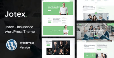
Jotex in Production: Rebuilding an Insurance Site’s Quote Flow
I rebuilt this insurance website because it was creating the wrong kind of leads and the wrong kind of workload. The old site looked acceptable and it technically “converted” in the sense that people submitted forms. But the submissions were frequently unusable: missing details, mismatched service types, unclear intent, and a lot of hesitant messages that sounded like someone testing whether we were real. At the same time, qualified prospects often didn’t submit at all—they browsed, bounced between pages, and left without taking the next step.
That kind of failure doesn’t come from a lack of design polish. It usually comes from a broken path: how we explain what happens next, how we separate information from intake, and how we structure trust without overpromising. Insurance is a trust-heavy decision, but it’s also a process-heavy decision. People want certainty, and you can’t responsibly offer it on a public page. What you can offer is clarity: “Here’s how the quote works,” “Here’s what we need,” “Here’s what happens after you submit,” and “Here are the boundaries.”
I moved the rebuild onto Jotex – Insurance WordPress Theme and treated it as a structural baseline for a quote-first website. This isn’t a feature list and I’m not writing marketing copy. I’m documenting what I did as the person who has to operate the site after launch: the decisions, the page grammar, the mistakes I corrected, and the post-launch adjustments that made the biggest difference.
The real problem: the site was asking for commitment too early
The old site had a pattern that’s common in service businesses: every page pushed “Contact us” as the primary action, and the forms were long, generic, and placed as if the visitor had already decided. But many insurance visitors haven’t decided yet. They’re testing risk, comparing providers, and trying to understand whether the process feels safe.
So the site created two opposite failures:
-
People who weren’t ready submitted vague messages (“Need insurance, call me&rdquo
 because the site didn’t guide them.
 -
People who were ready to get a quote left because the quote path didn’t feel clear or trustworthy.
If you operate the inbox, you can feel the difference instantly. Vague leads are not “more opportunities.” They’re operational noise.
So I reframed the rebuild around one goal: make the quote and inquiry paths feel structured and low-risk, without sounding persuasive or dramatic.
My constraint list before touching design
I start with constraints because otherwise you end up polishing confusion.
-
One canonical “Get a quote” path
Visitors should not wonder which form to use. -
Separate “education” from “intake”
Coverage pages explain; quote pages collect structured details. -
Consistent page grammar
Every coverage page answers the same questions in the same order. -
Trust through process, not claims
Calm expectations, transparent steps, no inflated language. -
Triage-friendly submissions
Forms should produce usable inputs so the team can respond quickly. -
Maintainable by non-technical staff
Fewer one-off layouts; templates that survive edits.
Everything else was secondary.
Why Jotex worked as the baseline
I didn’t pick Jotex because it “looks like insurance.” I picked it because it supports a service flow where visitors need clear, structured routes: coverage → eligibility/fit → quote intake → follow-up. Insurance sites often fail by mixing these roles on the same page.
I wanted a baseline that could support:
-
coverage categories without turning the menu into a sitemap
-
clear process explanations that don’t read like marketing
-
a quote intake page that feels guided and predictable
-
mobile readability (many people shop insurance on phones, often quickly)
Jotex gave me a workable skeleton for those goals, but the real improvements came from the structure rules I enforced.
The page grammar I enforced (what kept the site consistent)
I think in page roles. If every page tries to do everything, visitors don’t know where they are in the process.
The visitor modes I designed for
Insurance visitors tend to fall into four modes:
-
Urgent visitor: wants a next step without reading much
-
Cautious visitor: wants to understand risk and boundaries before sharing details
-
Research visitor: wants to compare coverage types and constraints
-
Returning visitor: wants to resume quickly and confirm what they already saw
The old site spoke to all four on every page. The rebuild separated them so each page has a primary job.
Homepage grammar: router, not brochure
Insurance homepages often become “trust walls” with long claims, badges, and generic “we care” copy. That rarely helps.
I made the homepage answer three questions quickly:
-
What types of coverage do you handle?
-
How does the quote process work?
-
What should I do next?
The structure I used:
-
a short scope statement (plain, not hype)
-
clear entry points into core coverage categories
-
a small “how quoting works” block (steps, in neutral language)
-
one path to “Get a quote” that stays consistent across the site
The goal was routing, not persuasion.
Coverage pages: consistent order, fewer words
Coverage pages are where drift happens. If each page is written differently, visitors can’t scan and operators can’t maintain.
I enforced a stable order:
-
What this coverage is for (short, practical)
-
Common situations (scenario-style, not marketing personas)
-
What we typically need (information categories)
-
Process (what happens in the quote workflow)
-
Boundaries (what’s not covered, jurisdiction limits if relevant)
-
Next step (quote intake link, consistently phrased)
I avoided writing anything that sounds like a promise. Insurance is sensitive; certainty needs to stay inside real underwriting and real discussions.
Quote intake pages: structured collection with reduced anxiety
This was the biggest operational win.
The “contact form” was replaced by a quote intake that felt like a guided checklist:
-
clear statement of what happens after submission
-
response time expectations (plain, realistic)
-
privacy note (short, normal tone)
-
structured fields that reduce vague messages
I kept one optional free-text field, but I tried to make most of the form structured so it’s triage-friendly.
The non-obvious part: trust is built through boundaries
Many people think trust means “more claims.” In insurance, trust is often built through boundaries and clarity.
So I added (and repeated consistently):
-
what the quote can and can’t do
-
what information is needed to proceed
-
what happens next after submission
-
typical timeline expectations (without certainty)
This reduced “test messages” dramatically. People stopped asking “Are you legit?” in indirect ways, because the process felt real.
Common mistakes I corrected (because they show up everywhere)
Mistake 1: multiple CTAs competing
If every section says “Get a quote” in a different way, the site feels chaotic. Visitors hesitate because they suspect a trap.
I kept the CTA wording consistent and limited the number of places it appears. The point is to be predictable, not loud.
Mistake 2: navigation turned into a long list
Insurance sites often add a menu item for every coverage variation. That creates confusion and makes the firm feel unfocused.
I kept navigation as a decision tree:
-
Coverage types (grouped)
-
How it works
-
About / Support
-
Get a quote
Everything else lives inside those paths.
Mistake 3: coverage pages that read like marketing
Overconfident language makes cautious visitors suspicious. They want to feel safe, not sold.
So I rewrote copy in an operational tone:
-
what this is
-
who it’s for
-
what we need
-
what happens next
No exaggerated adjectives. No “best.” No “perfect.”
Post-launch adjustments (what real traffic taught me)
After launch, I made a few changes that mattered more than any design tweak.
Adjustment A: people needed “where am I in the process” cues
Visitors were landing deep (on coverage pages from search) and didn’t always understand the next step.
I improved:
-
consistent headings
-
a small, repeated “process” block placement
-
clearer “next step” phrasing
Not more content—better placement.
Adjustment B: form questions needed better intent
Some fields produced garbage answers because users didn’t know what detail mattered.
I changed question wording to:
-
ask category first
-
ask timing/region next
-
ask key risk details in plain language
-
then offer optional notes
Lead quality improved; follow-up became faster.
Adjustment C: mobile scanability needed stricter discipline
Insurance browsing often happens quickly on a phone. Long paragraphs are walls.
I shortened paragraphs and made sure each section had a first line that clearly says why it exists.
Behavioral checkpoints I watch (simple, useful signals)
1) Do people reach quote pages but not submit?
If yes, it often means:
-
the quote feels risky
-
the next steps aren’t clear
-
the form feels too open-ended
The fix is usually clarity and structure, not persuasion.
2) Are submissions missing the same key details?
If yes, the form is asking the wrong questions or asking them in the wrong order. You can fix a surprising amount by changing phrasing and sequencing.
3) Do returning visitors move faster?
Returning visitors should move faster. If they don’t, your structure isn’t memorable.
So I avoid layout variation and keep page grammar consistent.
Light technical thinking: stability and update hygiene
Service sites need to feel stable and “boring” in the best sense.
I kept the build conservative:
-
minimal decorative scripts
-
predictable section structure
-
avoid layout shift on mobile
-
centralized styles; fewer one-off overrides
Operationally, I maintain a routine:
-
update during quiet windows
-
check homepage, one coverage page, quote page
-
submit a test form
-
spot-check mobile
If updates feel dramatic, the system is too fragile.
A workflow note: keeping a stable theme shelf
Because I maintain multiple builds and want consistent reference points, I keep a general catalog shelf bookmarked. I use the hub under WooCommerce Themes as an operational reference point when standardizing theme choices across projects (not as a visitor-facing path).
Closing: the rebuild goal was calm clarity, not louder messaging
Insurance sites don’t win by sounding confident. They win by being understandable. Visitors need to know what you handle, what you need from them, and what happens next—without feeling pressured or misled.
Using Jotex as the baseline, I focused on outcomes that reduce operational noise:
-
coverage pages became consistent and scannable
-
quote intake became structured and triage-friendly
-
boundaries became visible without sounding defensive
-
mobile browsing became less tiring
-
updates became routine
I measure success by whether the site stays coherent after months of small edits and whether the inbox contains fewer vague messages and more workable, qualified inquiries.
-