Renew Medical Rebuild Log: A Calm Clinic Site That Finally Flow
-
A Practical Rebuild Log: Making a Rehab Clinic Site Feel Clear, Not “New”
The rebuild started the way most of my rebuilds start: not with design, not with a demo import, but with a complaint that sounded vague and turned out to be specific.
“People are calling, but they still ask the same questions that are answered on the site.”
When you run a clinic website—especially a physiotherapy and rehabilitation clinic—this is a familiar frustration. It usually means the content exists, but the site isn’t guiding anyone to it. Visitors don’t move through the pages in the way we expect. They skim, get unsure, and switch to the simplest action: call, message, or leave.
I’m writing this as a long-form field note for other site admins: what I changed, in what order, and what I learned from actual behavior after launch. I’m not going to list features. I’m not trying to “sell” anything. This is mostly about sequence, structure, and maintaining a calm workflow when the site is already live.
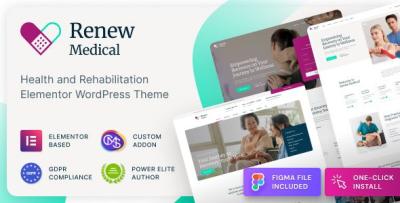
The theme I used for this rebuild was Renew Medical - Physiotherapy & Rehabilitation Clinic Medical WordPress Theme. I’m mentioning it early because it was the base, but the real story is how I used that base to reduce friction, not how many widgets it contains.
The Initial Problem: Our Content Was “Correct,” But the Flow Was Wrong
The clinic had good content: service descriptions, therapist bios, an FAQ, and a contact page. Yet visitors behaved as if those pages barely existed.
I pulled a few basic signals:
-
which pages people entered from (often Google landing directly on a service page)
-
how far they scrolled (many stopped early)
-
where they clicked next (surprisingly often: nowhere)
-
what questions callers asked (repeated patterns)
And the pattern was consistent: the site wasn’t helping people answer three practical questions quickly:
-
Is this clinic for my problem?
-
What should I do next?
-
How much effort will it take to get started? (time, steps, what to prepare)
In physiotherapy and rehab, visitors are often in mild discomfort, confused, or anxious. They don’t want long text. They want reassurance through structure: clear headings, short sections, and a feeling that the clinic is organized.
So I reframed the project from “make the site look professional” to “reduce cognitive load.”
My Decision Flow: I Started With the User Journey, Not the Homepage
A lot of rebuilds go wrong because we treat the homepage as the center of the world. For clinic sites, it usually isn’t. Many visitors land directly on:
-
a service page (e.g., back pain, sports injury rehab)
-
a therapist profile
-
a location page (especially on mobile)
-
a blog post answering a specific question
So I mapped the site as paths rather than pages.
Typical visitor intents on a rehab clinic site
-
“I have a symptom. Is this relevant?”
-
“I’ve been referred. What do I do now?”
-
“I want to compare therapists quickly.”
-
“I want to understand what the first session looks like.”
-
“I need location, hours, and access details.”
Then I grouped pages into three roles:
-
Entry pages: service detail pages, therapist profile pages, blog posts
-
Decision pages: pricing/insurance page, what-to-expect page, FAQ
-
Action pages: booking/contact, location directions, call/WhatsApp triggers (depending on region)
This reduced a lot of confusion. The homepage became a router—not a brochure wall.
What I Refused to Do: Import a Demo and “Patch It Later”
I’ve imported demos before. It can be fast. But it often creates a hidden cost: you spend weeks deleting blocks, swapping images, and fighting the theme’s default assumptions.
This time I took the quieter approach:
-
Set the theme base.
-
Build the page hierarchy first.
-
Create one “service page template” and one “therapist profile template.”
-
Only then scale across the rest.
It feels slower on day one, but faster overall because you don’t accumulate layout debt.
Building the Service Pages Like Decision Pages (Not Landing Pages)
Physiotherapy services are often overlapping: neck pain, posture issues, sports rehab, post-surgery rehab, chronic conditions. Visitors don’t want marketing language; they want clarity.
So I rebuilt service pages with a consistent rhythm:
-
A short opening that names the problem plainly (no big adjectives)
-
Who it tends to help (a short list, not a “feature” list)
-
What the first appointment usually covers (expectations reduce fear)
-
Common questions (a small FAQ that’s actually useful)
-
The next step (one obvious action, not three competing CTAs)
The key for me was writing in a calm, practical tone—more like patient guidance than a brochure.
I also tightened paragraphs aggressively. Long paragraphs read as “effort.” On mobile, effort equals bounce.
Therapist Profiles: What People Actually Scan For
Therapist profiles were a big lever. Visitors often decide trust based on profile structure more than on credentials.
Here’s what I saw:
-
People look for fit cues first: specialty, focus areas, approach style.
-
They want to know what the therapist treats frequently.
-
They don’t read long bios unless the first screen is already convincing.
-
If the “book/consult” action is missing or unclear, they drop and go back to Google.
So I reorganized profiles to support scanning:
-
A short “what I help with” section near the top.
-
A calm explanation of approach (2–4 sentences).
-
Credentials available, but not dominating the first screen.
-
Location/availability clarity.
-
A single next step.
No fluff. No vague statements like “passionate about helping.” Those lines rarely build trust; they sound copied.
A Common Mistake I Corrected: Too Many “Next Steps” at Once
On many clinic websites, every page ends with:
-
Book now
-
Contact us
-
Call
-
WhatsApp
-
Ask a question
-
View location
-
See services
That’s not helpful. It creates decision paralysis.
Instead, I tried to make each page answer: what is the next best step for someone who landed here?
-
Service page → request assessment / booking inquiry
-
Therapist profile → choose this therapist (or compare therapists)
-
Location page → directions + quick contact
-
FAQ page → if still unsure, contact with a guided question form
Not loud. Not “sales.” Just clear.
Information Architecture Changes That Made the Site Feel “More Professional”
Here’s the uncomfortable truth: many “design problems” are really hierarchy problems.
The site felt more credible after I did boring things:
-
simplified menu labels
-
reduced the number of top-level items
-
made services discoverable in 1–2 taps, not 3–4
-
ensured every service page linked naturally to relevant therapist profiles
-
ensured every therapist profile pointed back to the relevant service cluster
I didn’t add more content. I made content easier to move through.
The Ops View: Keeping Updates Calm and Predictable
Because I maintain these sites long-term, I care about what happens after the rebuild:
-
plugin updates
-
content edits by staff
-
occasional urgent notices (holiday hours, closures)
-
new therapists joining
-
new services added
So I set guardrails:
-
Standard section order for service pages.
-
Standard section order for therapist pages.
-
A short internal checklist for staff who edit content:
-
keep paragraphs short
-
avoid uploading huge images
-
don’t paste formatting from Word documents
-
keep headings consistent
-
preview on mobile before publishing
-
Most breakages aren’t caused by themes. They’re caused by content editing habits.
Light Technical Work: Performance Without Obsessing
I didn’t chase perfection. I chased consistency.
My performance workflow is always the same:
-
Fix images first (size, compression, format).
-
Limit font weights (most sites use too many).
-
Avoid heavy hero elements that load late.
-
Reduce page sections that don’t serve a decision.
-
Only then look at caching and scripts.
With rehab clinic sites, mobile stability matters more than a desktop score. People use these pages on the go.
The rebuild felt faster mainly because pages became simpler and more structured. That’s the quiet advantage of a stable base: you don’t need to “optimize” your way out of a messy layout.
After Launch: What Changed When I Watched Real Behavior
This is where the rebuild became real. After launch, I looked for friction:
-
service pages with high exits
-
therapist pages where people didn’t click anything
-
location pages where visitors bounced quickly
-
FAQ pages that didn’t lead to action
And then I made small edits:
-
moved “what to expect” slightly higher on service pages
-
shortened the first section on a few services (too dense)
-
made therapist focus areas more scannable
-
adjusted internal links between services and therapists
None of these changes were dramatic. That was the point. I didn’t want weekly redesigns. I wanted quiet improvements.
A Misconception I Had to Correct: “People Want Lots of Proof”
They want signals of organization:
-
a clean page rhythm
-
consistent structure
-
clear next steps
-
content that feels written for real patients, not for marketing
Overloading pages with badges, counters, and testimonials can backfire. It looks like persuasion.
Rehab clinics benefit from calm clarity more than from loud proof.
How I Kept the Homepage Under Control
I didn’t let the homepage become a dumping ground. I gave it a strict job:
-
identify the clinic
-
route visitors to the right path
-
provide one credibility block
-
provide one educational preview
-
stop
Everything else belongs on dedicated pages.
When a homepage is long, visitors scroll without deciding. When a homepage is structured, visitors choose a path.
Category Structure Note (Admin Hygiene)
While rebuilding, I cleaned up how theme-related assets were organized on the admin side. It sounds minor, but taxonomy hygiene reduces mistakes long-term.
I kept the structure simple under WordPress Themes and avoided clever naming that looks good once but confuses staff later.
When you maintain dozens or hundreds of pages, boring structure is a form of stability.
What I’d Do Differently Next Time
Even with a clean rebuild, I always learn:
-
I would lock the content templates earlier so stakeholders don’t ask for page-by-page variations.
-
I would write the “first visit” explanation (what happens in session one) earlier—it reduces anxiety and increases contact quality.
-
I would simplify the FAQ earlier and make it more scenario-based, not generic.
-
I would enforce a stronger “one page, one decision” rule from day one.
Again: process, not theme.
Closing: The Outcome I Actually Wanted
I didn’t want a site that “looks redesigned.” I wanted a site that behaves predictably:
-
Visitors find the right page quickly.
-
They understand what to do next.
-
Mobile pages feel readable and calm.
-
Staff can update content without breaking layouts.
-
The site can grow without becoming a patchwork.
That’s the kind of professional that lasts: not flashy, not promotional, not overloaded—just structured, steady, and easy to maintain.
If you’re the person who has to keep the clinic website alive while improving it, you’ll understand why my favorite result is not praise. It’s silence.
Silence means fewer confused calls, fewer “where do I click?” messages, fewer emergency fixes after updates—and a website that quietly does its job.
-