Categories
Tags
Archives
What Changed After I Rebuilt a Clothing Store with Shella WooCo
-
Rebuilding a Fashion Store the Slow Way: Notes from a Live WooCommerce Site
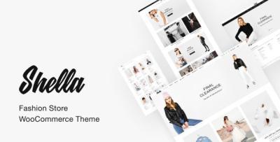
The decision to rebuild my fashion store didn’t come from a desire to redesign anything flashy. It started with a quiet frustration I couldn’t ignore anymore. My existing WooCommerce setup technically worked, but maintaining it felt heavier each month. Updates caused layout inconsistencies, mobile behavior felt unpredictable, and small changes required more effort than they should. When I finally decided to restructure the store, I ended up working with Shella - Fashion Store WooCommerce Theme, not because it promised anything revolutionary, but because its structure seemed calm enough to disappear into the background.
This article isn’t a feature list or a recommendation. It’s a record of what actually changed after rebuilding a real store, written from the perspective of someone who has to keep the site alive long after launch.
Where the Real Problem Started
Before touching the theme, I spent time documenting how visitors actually moved through the site. Most didn’t land on the homepage. They entered through category listings or search results, skimmed quickly, and left if the layout didn’t guide them forward. The issue wasn’t content quality or product pricing. It was friction — small, accumulated delays in decision-making.
The old setup made every page feel like a landing page trying too hard. There was too much emphasis on visual blocks and not enough clarity in how information unfolded. For a fashion store, that matters more than people admit.
Choosing Structure Over Decoration
When I evaluated different directions, I deliberately avoided thinking in terms of “better-looking” themes. Instead, I focused on structural predictability. How consistent is spacing between sections? Do category pages behave like category pages, or are they styled as promotional pages? Can I change content without breaking the visual rhythm?
That’s where Shella stood out for me. It didn’t fight WooCommerce’s natural hierarchy. Product grids behaved like grids. Filters felt like utilities, not design statements. This reduced my cognitive load as an administrator — something I value more than aesthetic novelty.
First Impressions After Deployment
The first thing I noticed after setting up the new theme was how little I had to adjust to make things usable. That might sound unremarkable, but in practice it’s rare. I didn’t need to rebalance spacing manually or rewrite product excerpts to fit a layout. The theme seemed to assume that content would evolve over time, not stay frozen at launch.
I spent the first few days doing nothing but browsing the store like a visitor. On desktop, the flow felt linear and calm. On mobile, there was less visual compression than before. Navigation elements stayed out of the way instead of competing for attention.
Living With the Theme as an Admin
After the initial setup, the real test began: living with the theme while doing routine admin work. Updating products, adjusting categories, handling promotions, and monitoring checkout behavior are the tasks that define daily reality.
What changed most was predictability. When I edited something, I could anticipate the result. That sounds trivial, but it reduced the mental overhead of maintenance. I didn’t have to preview every small change in fear of unintended layout shifts.
Over time, this predictability affected how often I updated the site. I became more willing to refine copy, adjust images, and clean up categories because the risk felt lower.
Observing Visitor Behavior Post-Rebuild
One of the most telling signals came from analytics, but not the usual headline metrics. Bounce rate fluctuated, but session depth improved. Visitors who entered through product listings were more likely to browse a second or third item.
I attribute this less to visual appeal and more to structural clarity. When a page doesn’t shout for attention, users seem more willing to explore. The theme didn’t try to “sell” — it simply organized information in a way that respected how people shop.
The Role of Category Pages
In fashion stores, category pages do more work than product pages. They’re where decisions start forming. I paid special attention to how these pages behaved after the rebuild.
The new setup made category browsing feel less like scrolling through a catalogue and more like scanning a curated list. The difference wasn’t dramatic, but it was consistent. Over time, this consistency mattered more than any single visual change.
While reorganizing my categories, I also revisited how themes are grouped and presented, especially in broader collections like Business WordPress Themes, where structure determines discoverability more than design flourishes.
Maintenance Over the Long Term
After a few weeks, the novelty wore off — which is exactly what I wanted. A theme shouldn’t demand attention once it’s doing its job. Updates didn’t introduce surprises. WooCommerce upgrades integrated smoothly. I didn’t feel like I was constantly patching around design decisions made by someone else.
This stability changed how I planned future updates. Instead of scheduling large redesigns, I started thinking in smaller, incremental improvements. That’s healthier for both the site and the person maintaining it.
Mistakes I Avoided This Time
One conscious decision I made was not to over-customize early. In past projects, I’d tweak typography and spacing immediately, only to regret it later. This time, I let the default structure breathe for a while.
By observing real usage first, I avoided premature optimizations. The theme’s restraint helped here — it didn’t tempt me into endless visual adjustments.
What Didn’t Change (And Why That Matters)
Not everything improved dramatically, and that’s worth stating. The theme didn’t magically increase conversions or fix pricing issues. It didn’t replace the need for good product photography or clear descriptions.
What it did was remove friction from the system. It reduced the number of small decisions I had to make as an admin and the number of small obstacles users faced as visitors. Over time, that cumulative effect is what made the rebuild worthwhile.
How the Theme Changed My Decision-Making Rhythm
One of the less obvious effects of the rebuild was how it altered my own behavior as a site owner. Before, I hesitated before making changes. Every edit felt like it might trigger a chain reaction somewhere else — a broken layout on mobile, an awkward spacing issue, or an unexpected visual clash. That hesitation slowed down iteration.
After switching structures, that friction eased. I started making smaller, more frequent decisions instead of postponing everything into “one big update.” This shift mattered more than I expected. A store evolves through dozens of small corrections, not dramatic redesigns.
Editing Content Without Second-Guessing
Product descriptions are living documents. Prices change, collections rotate, and tone evolves with the brand. With my previous setup, editing content felt like working around the theme. Paragraph lengths had to be controlled, images needed manual alignment, and any deviation from the original format looked out of place.
This time, the theme didn’t impose a narrative. It accepted content variations without visually punishing them. I could shorten descriptions, add context, or remove sections without rethinking the entire layout. That freedom made content maintenance feel less like design work and more like writing — which is how it should be.
Mobile Experience as a Baseline, Not an Afterthought
I didn’t redesign the store with a “mobile-first” slogan in mind, but I did change how I evaluated success. Instead of perfecting desktop layouts and adapting later, I browsed the store almost exclusively on my phone during the first weeks.
What stood out was not visual elegance but restraint. Navigation elements stayed accessible without crowding the screen. Product grids didn’t collapse into awkward stacks. Scrolling felt continuous rather than segmented.
This consistency reduced the need for device-specific fixes. I wasn’t maintaining two experiences anymore — just one coherent structure that scaled naturally.
Performance Perception vs. Raw Metrics
I’m careful not to overinterpret performance metrics. Numbers can fluctuate for reasons unrelated to design. Still, perception matters. A site that feels responsive keeps users engaged even if raw load times improve only marginally.
After the rebuild, pages felt calmer. There were fewer visual jumps during load, fewer elements competing for immediate attention. Even without dramatic speed gains, the experience felt smoother — and that perception influenced how long visitors stayed.
From an admin perspective, this also meant fewer support messages related to “site not loading properly,” which are often perception issues rather than actual failures.
How the Theme Influenced My SEO Workflow
I didn’t change my SEO strategy alongside the theme. Metadata rules stayed the same. URL structures remained untouched. Yet the way I approached optimization shifted.
Instead of fighting layouts to insert content, I focused on clarity. Headings existed where they made sense. Supporting text fit naturally without padding. Category descriptions stopped feeling like forced additions and started acting as context.
This alignment between structure and content reduced the temptation to over-optimize. I wasn’t stuffing keywords to fill visual gaps. I was writing because the layout made space for explanation.
Long-Term Stability and Updates
After several update cycles — WordPress core, WooCommerce, and plugins — the theme proved predictable. No unexpected layout regressions. No sudden incompatibilities that required emergency fixes.
This reliability changed how I scheduled maintenance. Updates became routine instead of events. I stopped postponing them out of caution, which in turn reduced technical debt. Stability doesn’t just prevent problems; it encourages healthier habits.
What I’d Do Differently Next Time
If I were to rebuild again, I’d spend even more time observing before customizing. The biggest improvements came not from tweaking settings but from understanding how users navigated the site after launch.
I’d also document decisions more carefully. Not for others — for myself. Knowing why a structure exists makes it easier to evolve without undoing progress.
Misconceptions I Had About “Fashion Themes”
Before this project, I assumed fashion-focused themes prioritized visuals over structure. That assumption led me to avoid them in the past. This experience corrected that bias.
A theme doesn’t have to be loud to serve a visual industry. Sometimes, the most supportive design choice is to step back and let products exist without commentary.
The Quiet Value of Not Standing Out
There’s a strange relief in running a site that doesn’t constantly demand attention. Visitors don’t comment on the theme. They don’t ask how the site was built. They just browse, decide, and leave or stay.
As an administrator, that silence is valuable. It means the system is doing its job.
Final Thoughts After Living With the Rebuild
Months after the rebuild, the most telling sign of success is how little I think about the theme itself. It has become infrastructure rather than decoration. Decisions feel lighter. Maintenance feels manageable. The site feels like a tool again, not a project in constant flux.
I didn’t gain a perfect store or a dramatic transformation. What I gained was stability, clarity, and a structure that supports change instead of resisting it. For a long-running WooCommerce fashion store, that trade-off has proven worthwhile.