A Charity Crowdfunding Site I Could Maintain Calmly
-
A Charity Crowdfunding Site I Could Maintain Calmly
I didn’t rebuild our charity site because I wanted a new look. I rebuilt it because I was tired of feeling nervous every time I had to update a donation page.
The moment that forced my hand was a small operational mistake: we extended a campaign by a week, updated the date in one place, and forgot another. A supporter emailed—politely—asking which date was correct. Nothing “broke,” but trust is fragile in fundraising. Once people sense inconsistency, they hesitate, and hesitation is the enemy of follow-through. That email made me realize the real problem wasn’t design or copy. The problem was that the site structure didn’t help me maintain accuracy under pressure.
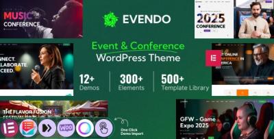
I ended up moving the project onto TheFude – Crowdfunding Charity WordPress Theme, not as a “theme purchase decision” but as an attempt to put the site on rails: predictable sections, consistent page patterns, and fewer opportunities for accidental contradictions. I’m writing this as a long admin note, not a review. It’s about the decisions I made, the order I made them in, and what changed once the site had been live long enough to produce real behavior.
I’m also writing this for the version of myself that kept thinking “I’ll fix it after this campaign.” The truth is: campaigns never stop. If the structure is brittle, you pay the cost forever.
The problem I was actually solving: trust under time pressure
Charity crowdfunding is a strange corner of the web. It has many of the mechanics of ecommerce—clear calls to action, checkout flows, receipts, conversion points—but the emotional context is different. People aren’t buying a product. They’re placing trust.
When a supporter lands on a campaign page, they’re doing a quiet mental audit:
-
Is this real?
-
Is this specific?
-
Is it clear what happens if I donate?
-
Is this organization consistent and careful?
-
Can I find what I need without hunting?
We tend to interpret that audit as “branding,” but I’ve learned it’s more about information behavior. An honest site with a confusing structure can still feel suspicious. A modest site with consistent structure can feel reliable.
My old site had what I would call “content correctness” but not “structure correctness.” The information existed, but it didn’t flow. Campaigns didn’t share a consistent layout. The donation pathway wasn’t uniform across pages. Policies appeared in some places and disappeared in others. My admin workflow was basically a series of patches.
So I framed the rebuild as a trust engineering task. Not in the sense of manipulation—more like: how do I reduce the ways the site can accidentally contradict itself?
I stopped thinking in pages and started thinking in journeys
Before touching WordPress, I wrote down the three main journeys I saw repeatedly:
Journey A: The first-time supporter
They’re careful. They read. They want a clear explanation of the campaign and some proof of seriousness. They’re often willing to donate, but not if anything feels off.
Journey B: The returning supporter
They already trust the organization. They want speed: “Is this the current campaign? How far along is it? What’s the fastest way to donate again?”
Journey C: The internal admin journey
This is the forgotten one. I needed a site I could update without anxiety: publish a new campaign, edit a progress note, adjust a goal, fix a typo, swap a banner, add an FAQ line—all without creating chaos.
Most themes can help with the first two journeys. Fewer help with the third, because the third is about repeatability and maintenance discipline.
So I built the new structure around a simple idea: every campaign should feel like it belongs to the same system. No “special cases” unless absolutely necessary.
A quiet decision: I avoided writing “better” copy at first
My instinct was to rewrite everything. It felt productive. It would also have been a mistake.
When you rewrite everything during a rebuild, you create a moving target. You can’t tell whether a drop in donations is due to structure changes or messaging changes. More importantly, you risk spending your energy on phrasing while the underlying navigation remains confusing.
So I did the opposite: I froze most copy early. I focused on the layout and information hierarchy first. Once the hierarchy was stable, I refined wording gradually, with the hierarchy acting as guardrails.
This decision reduced stress. It also revealed something: many “copy problems” are actually structure problems. If the page flow is clear, copy can be simpler and calmer. If the page flow is unclear, copy tries to compensate by explaining everything, which creates bloat.
The homepage: I treated it like a front desk, not a campaign page
A common trap in charity sites is turning the homepage into the “main campaign page.” It’s tempting, because you want to highlight what matters now. But homepages are visited by mixed audiences: donors, volunteers, partners, press, and sometimes people verifying legitimacy.
So I made the homepage do four things, in order:
-
Confirm who we are (in plain terms, no slogans)
-
Highlight the current campaign as a route, not as the whole homepage
-
Provide a simple “how funds are used” summary
-
Offer a stable navigation structure to other essential pages (about, transparency, contact)
The key word here is stable. The current campaign changes. The organization doesn’t. If you rebuild the homepage around a campaign that expires in 30 days, you’re creating a constant redesign obligation.
Instead, I used the homepage as a calm entry point, with a clear path to the current campaign and a clear path to credibility context. That’s not “marketing.” That’s reducing uncertainty.
The campaign page: where structure matters more than persuasion
Campaign pages are where well-meaning organizations accidentally become messy. People keep adding updates, photos, stories, sponsor mentions, partner quotes, and deadline reminders. Over time, the page becomes a scrapbook. Supporters might love the mission, but the page becomes hard to scan.
I set a strict internal rule for campaign pages:
-
The top portion is for orientation and action.
-
The middle portion is for context.
-
The bottom portion is for updates and details.
This sounds obvious, but it prevented a lot of bad decisions. When someone on the team said “add this update to the top,” I could say “it belongs in the update area.” That’s not a style preference; it’s maintenance governance.
Orientation and action: what I prioritized
I made sure the first screen answered a few essential questions without emotional theatrics:
-
What is the goal (specific)
-
Where does the money go (concrete categories, not vague promises)
-
What happens after donation (receipt, updates, acknowledgment)
-
How progress is tracked (so people understand what the numbers mean)
I avoided heavy animation and avoided stacking too many blocks. The first screen should reduce anxiety, not create a sense of performance.
Context: telling a story without losing structure
I’m not against storytelling. But I learned to place story inside a stable frame. Instead of letting story become a wandering essay, I constrained it:
-
What problem are we addressing?
-
Why does it matter now?
-
What is the plan?
-
What will success look like?
Those questions are not “sales.” They are clarity. They also help you avoid unintentional exaggeration, because you’re describing a plan rather than making claims.
Updates: acknowledging reality without drowning the page
Updates are important for trust. The problem is how they are added. If updates are inserted randomly into the middle of a page, the page loses coherence. So I created a consistent update area and kept updates short, factual, and dated.
Supporters appreciate updates because updates reduce uncertainty. But they don’t need updates to feel like press releases.
The operational side: reducing the cost of being wrong
One reason fundraising sites feel inconsistent is that there are many small details you can get wrong:
-
deadlines
-
goals
-
matching periods
-
tax language
-
shipping of perks (if any)
-
geographic scope
-
eligibility criteria for beneficiaries
-
distribution timelines
Even if your mission is honest, small mistakes create doubt. So I treated the site like a system that should prevent me from accidentally being inconsistent.
I did two structural things that helped:
-
I consolidated policy language into dedicated pages instead of repeating it in every campaign.
-
I used consistent patterns for “campaign details” across pages, so updates didn’t require rewriting sections from scratch.
The second point sounds like a theme feature, but it’s more a discipline: if the theme makes patterns easy to repeat, you’ll repeat them. If repetition is hard, you’ll improvise, and improvisation is where inconsistency is born.
A mistake I corrected: trying to be “too transparent” everywhere
This will sound strange, but I initially tried to include transparency details everywhere: in every campaign, in every section, in every footer. It felt responsible. It also made pages heavy and repetitive.
I learned that transparency works better when it is:
-
easy to find
-
consistent in location
-
stated calmly
-
kept up to date
Transparency is not helped by duplication. Duplication creates drift. Drift creates contradictions. Contradictions destroy trust faster than absence.
So I placed transparency information in stable parts of the site, linked consistently, and referenced it briefly where relevant. That created a single source of truth.
How I handled “proof” without turning it into a badge wall
Many fundraising sites try to prove legitimacy by adding badges, logos, certificates, partner lists, and “as seen in” blocks. Sometimes this helps. Often it becomes clutter and looks like overcompensation.
I chose a quieter approach:
-
clear organization identity and contact
-
clear explanation of fund use
-
calm update cadence
-
consistent structure across pages
I also included specific, plain statements about operational practice: how updates are posted, how funds are allocated, and how campaign completion is communicated. Those statements act like proof because they describe process.
Process is harder to fake than slogans. People sense that.
User behavior I observed after launch
I’m not a fan of obsessing over analytics, but for this kind of site, a few behaviors were more useful than vanity metrics.
First-time supporters scanned for “what happens after donation”
I could tell because the sections explaining receipts and follow-up updates were getting disproportionate attention. This is rational. People want to know whether they’ll receive confirmation and whether they’ll be kept informed.
When that information was clear and consistent, I saw fewer support emails asking “did my donation go through?” and fewer anxious follow-ups. That matters operationally because those emails are time-consuming and emotionally loaded.
Returning supporters didn’t browse; they navigated directly
Returning supporters rarely read the story again. They looked for the donate action and the current progress. If those were not prominent, they bounced.
So I made sure the page respected both user types: story for first-time supporters, direct action for returning supporters—without forcing either group to endure content they don’t need.
People used mobile more than I expected during campaign peaks
During active campaign pushes, most traffic was mobile. That changed how I thought about layout. Mobile visitors aren’t casually reading. They’re often coming from a message or social share and deciding in a minute.
That’s why calm spacing and clear headings matter more than clever design. You can’t rely on hover states, subtle cues, or complex multi-column layouts on mobile. The site has to speak clearly with minimal interaction.
A “non-feature” that mattered: edit safety
Here’s the honest admin reality: on campaign weeks, edits happen under stress.
Someone notices a typo. Someone asks to update a figure. Someone requests a new paragraph. Someone wants to add a small clarification. You don’t have time to think deeply about layout. You need to edit without breaking the page.
So I optimized for edit safety:
-
fewer deeply nested blocks
-
fewer “fancy” sections that break when text length changes
-
consistent heading hierarchy
-
predictable spacing that doesn’t collapse with longer text
This isn’t glamorous, but it’s the difference between a site you can maintain and a site you fear.
If you’ve ever updated a page at midnight and then stayed awake wondering what you broke, you know exactly what I mean.
Common misconceptions I corrected for my own team
I didn’t build the site alone. Even if you’re the only one with admin access, the content often comes from multiple people. So I wrote down a few internal guidelines and gently reinforced them.
Misconception 1: “If it’s important, put it at the top”
This is the most common mistake. Not everything important belongs at the top. The top is for orientation and action. Updates and extra context belong in their zone.
Misconception 2: “More story means more donations”
Sometimes story helps, but story without structure exhausts people. A clear plan and clear allocation often does more than another emotional paragraph.
Misconception 3: “We should add a new section for this”
Every new section creates maintenance debt. I tried to fit new information into existing structure first. Only if it truly didn’t fit would I add something new.
This mindset reduced site bloat over time.
The decision process I followed during the rebuild
To keep myself honest, I followed a staged workflow. It prevented me from falling into endless “tweak loops.”
Stage 1: Define the stable skeleton
I created a skeleton that wouldn’t change campaign to campaign:
-
homepage structure
-
campaign structure
-
transparency location
-
contact location
-
update format
Stage 2: Create one campaign page as the template
I built one campaign thoroughly and then used it as the baseline for others. Not copy-paste chaos—more like: “this is what a campaign page is supposed to look like.”
Stage 3: Simplify navigation ruthlessly
I removed any navigation items that didn’t serve a real journey. Too many menus create doubt. People interpret over-complex navigation as disorganization.
Stage 4: Only then adjust language
Once the structure worked, I refined phrasing so it felt calm and specific. But I kept adjectives minimal. I avoided dramatic claims. I wrote like an admin, not like a marketer.
A note on “crowdfunding logic” and why structure matters
Crowdfunding has a unique tension: you want urgency, but you also want calm credibility. If you push urgency too hard, you feel manipulative. If you are too calm, supporters might not feel the momentum.
I tried to solve that tension structurally rather than rhetorically. Instead of writing “urgent” sentences, I made the progress information and timeline visible in a steady, factual way. The page itself communicates that the campaign has movement, without me needing to shout.
In my experience, supporters respond better to factual momentum than to emotional urgency.
The post-launch routine that prevented drift
A charity site doesn’t stay clean by accident. It stays clean because you treat it like an operational system.
After launch, I created a small routine that I could actually maintain:
-
Weekly: review the active campaign page for contradictions (dates, goals, numbers)
-
Weekly: post one short update if there’s real movement
-
Monthly: check transparency and contact details
-
After campaign: archive cleanly and keep the page accessible without turning it into a dead end
Archiving is important. People revisit old campaigns to validate trust. If old pages disappear or look broken, it creates doubt about the present.
So I kept old campaigns accessible but clearly labeled as completed, with a final update and a summary. The key is clarity without clutter.
The quiet role of category discipline
Even when you’re not “selling products,” it helps to think like a catalog builder. Campaigns are items in a collection. Collections need consistent labeling and consistent layout. When that discipline exists, everything feels less chaotic.
I sometimes use browsing patterns from theme catalogs to remind myself what “consistent item browsing” feels like from the user side. A clean collection of WooCommerce Themes is a simple example: consistent cards, consistent layout, predictable behavior. I’m not trying to mimic ecommerce, but I am trying to mimic that sense of order.
Order is calming. Calming is trust-building. Trust-building is the point.
What I would do differently next time
Even though the rebuild worked, there are a few things I would change earlier if I had to do it again.
1) I would build the update system before writing the story
Updates are not optional in crowdfunding. They’re a trust mechanism. If you don’t plan updates structurally, they get shoved into random places, and the page becomes messy.
2) I would enforce “single source of truth” more aggressively
If a date appears in five places, you will eventually forget one. I would reduce repeated details and rely more on stable, dedicated areas.
3) I would test mobile reading with real time pressure
It’s one thing to “preview” on mobile. It’s another to act like a supporter: open the page from a message, scan for progress, decide, donate, and move on. That experience is what matters during campaign spikes.
Closing thoughts: a fundraising site should lower anxiety, not raise it
I don’t think a charity crowdfunding site succeeds because it looks polished. It succeeds because it feels consistent, specific, and carefully maintained.
That’s what I was trying to build: a site I could update quickly without fear, a site that doesn’t contradict itself, and a site that respects the supporter’s time and attention.
The theme choice wasn’t the “solution.” The solution was adopting a structure that encourages disciplined behavior: stable page flows, predictable update zones, calm language, and fewer one-off patches.
After living with the rebuilt site through real campaign weeks, the biggest change I noticed wasn’t an analytics number. It was my own stress level. I stopped dreading updates. I stopped worrying that every edit would create a new inconsistency. And when supporters emailed, their questions were more precise—less “is this real?” and more “how can we help next?”
That difference—subtle, but consistent—is what I wanted from the start.
-